
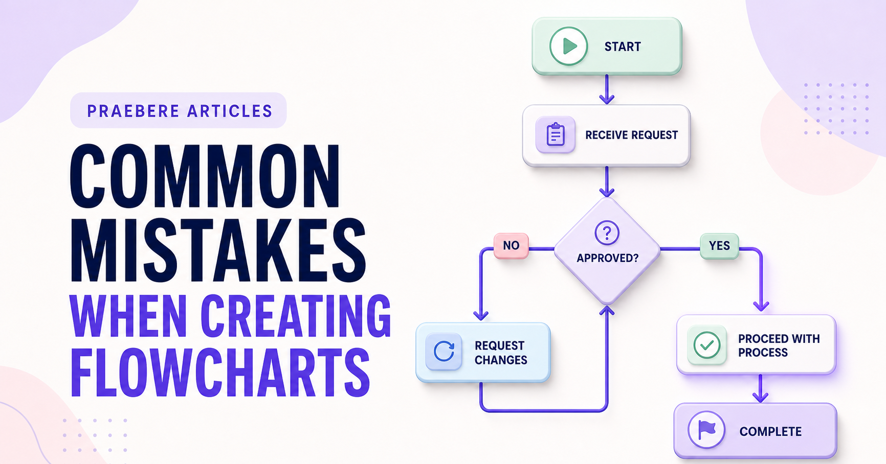
Small choices can create large problems
The value of “Common Mistakes When Creating Flowcharts” becomes clearer when attention shifts to “Starting without a clear scope.” A process model needs an explicit scope, start and end events, actors, inputs, outputs, decisions, exceptions, and ownership.
The practical challenge begins when general advice meets real content, real constraints, and a real audience. What question should the data answer, and could the chosen scale or comparison lead viewers toward the wrong conclusion? Which definitions, baselines, filters, and uncertainties must remain visible before the audience can act on the pattern? The sections ahead use these questions to move from the central idea to concrete decisions, technical criteria, and an applied example.
Starting without a clear scope
A flowchart becomes difficult to finish when its trigger, outcome, audience, and level of detail are undefined. Related processes continue to enter the diagram until the original question disappears.
Write a short purpose statement before drawing. If a step does not help that audience understand or perform the process, move it to supporting documentation or a separate subprocess.
Using inconsistent symbols and vague labels
Changing the meaning of shapes or colors forces readers to interpret each object from scratch. Use a small, consistent vocabulary and add a legend only when the conventions are not obvious.
Process labels should name actions, while decision labels should ask clear questions. Avoid placeholders such as “handle request” when the box could state who reviews what and what outcome it produces.
Creating ambiguous paths and tangled layouts
Unlabeled decision branches, arrows pointing in inconsistent directions, and crossing connectors make the process hard to follow. Arrange the main path in one dominant direction and place branches close to the decision that creates them.
Do not rely on color alone to distinguish paths. Use labels, line styles, position, and shape meaning so the diagram remains understandable in different viewing conditions.
Including too much detail without testing the chart
Long paragraphs inside shapes and every possible exception make a chart technically complete but practically unusable. Use levels of detail and link to supporting instructions rather than shrinking text to fit one page.
Walk through realistic scenarios and verify every branch, loop, and endpoint. In Praebere, previewing an ordered presentation path can expose confusing jumps and crowded framing, helping you refine the diagram before sharing or exporting it.
Technical implementation notes
A process model needs an explicit scope, start and end events, actors, inputs, outputs, decisions, exceptions, and ownership. Use consistent symbols and verb-led activity labels, and separate the normal path from failures, retries, escalations, and manual review.
Validate the model by walking through real cases with the people who perform the work. Record assumptions, system boundaries, rule sources, version, owner, and review date so the diagram remains traceable instead of becoming an attractive but stale picture. The most relevant concepts here are flowchart mistakes, flowchart best practices, improve flowchart. Define them when first used and apply each term consistently to an observable element, rule, or outcome.
- Every branch has a labeled condition
- Activities identify an action and responsible actor
- Exceptions and handoffs are visible
- The model has an owner and review trigger
Worked example: Common Mistakes When Creating Flowcharts
Assume monthly conversion moved from 4.0% to 4.6%. Before presenting a 15% relative increase, define conversion, show the absolute change of 0.6 percentage points, disclose the period, denominator, traffic mix, and uncertainty, and compare the same seasonal period when relevant.
Use a line or dot plot with a consistent scale, annotate the intervention date, and separate observation from attribution. End with a decision rule—for example, expand the test only if the lift persists and guardrail metrics remain within their thresholds.
Conclusion
The article’s main threads—starting without a clear scope, using inconsistent symbols and vague labels, creating ambiguous paths and tangled layouts, and including too much detail without testing the chart—lead to a shared lesson: the quality of “Common Mistakes When Creating Flowcharts” can be tested. Technical criteria and a realistic example make strengths, omissions, and consequences visible.
For us, the idea reaches its most useful conclusion here: a process visual becomes trustworthy only when it includes real decisions, responsibilities, handoffs, exceptions, and outcomes. The neatest diagram is not necessarily the most truthful one.
Create the visual journey
Turn your process into a presentation
Build the diagram, choose the sequence, add narration or webcam video, and preview the camera movement in your browser.
Open Praebere