
The practical decisions behind “How to Align Elements Correctly in a Presentation”
The visible choices in “How to Align Elements Correctly in a Presentation” grow from the earlier decision described by “Alignment creates visible relationships.” Treat the presentation as an information system: every element needs a purpose, a place in the reading order, and a relationship to the decision or idea being explained.
The practical challenge begins when general advice meets real content, real constraints, and a real audience. What should the audience notice first, and does the visual system make that priority unmistakable at the real viewing size? Which choices improve hierarchy and readability, and which ones merely make the slide look decorated? The sections ahead use these questions to move from the central idea to concrete decisions, technical criteria, and an applied example.
Alignment creates visible relationships
Alignment is more than making a slide look tidy. Shared edges and centers tell the audience that elements belong to the same structure. Misalignment can suggest a distinction that does not exist or make related information feel disconnected.
Choose an alignment based on meaning. Text blocks often work well with a shared left edge because reading begins from a stable point. Cards in a comparison may need aligned tops and equal widths so differences in content, rather than position, receive attention.
Establish a simple grid
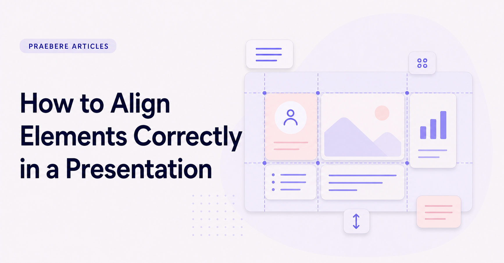
A grid provides repeatable reference lines for margins, columns, and content areas. It does not need to be visually complex. A consistent outer margin and a small number of columns are often enough to organize titles, visuals, and supporting text.
Use the same grid across related slides. Elements can span different columns, but their edges should return to shared lines. This creates variety without making each slide feel like a separate design system.
- Set consistent outer margins.
- Choose a small number of columns.
- Align titles to a recurring starting line.
- Keep repeated components on shared guides.
Understand alignment and distribution
Alignment places selected elements on the same edge or center line. Distribution controls the space between several elements. A row can be perfectly aligned and still look uneven if the gaps vary without purpose.
Use equal distribution for components with equivalent roles, such as steps or comparison cards. When elements have different importance, spacing can vary, but the difference should support grouping and hierarchy rather than result from manual placement.
Make optical adjustments when geometry is not enough
Mathematical centers do not always look centered. Icons with uneven shapes, circular elements beside rectangles, and text with unusual letterforms may need a small optical adjustment. Use guides first, then inspect the result at normal viewing size.
Avoid turning optical adjustment into random nudging. Compare the visual weight on both sides and preserve consistent relationships across repeated elements. If every instance requires a different correction, the underlying component may need redesign.
Align diagrams for movement and presentation
In flowcharts, alignment helps connectors travel in clear directions and reduces unnecessary crossings. Place related stages on shared rows or columns, keep branch spacing predictable, and leave enough room for labels and camera framing.
Praebere lets the presentation camera move between elements on the board. A well-aligned diagram makes those transitions easier to follow because the audience can preserve spatial context as the sequence advances from one shape to the next.
Technical implementation notes
Treat the presentation as an information system: every element needs a purpose, a place in the reading order, and a relationship to the decision or idea being explained. Define a grid, type scale, spacing scale, color roles, and reusable components before polishing individual screens.
Test the complete sequence at the real viewing size. Check hierarchy at a glance, line length, contrast, alignment, source accuracy, narration timing, and whether the audience can identify the main point without relying on decoration. The most relevant concepts here are align slide elements, presentation alignment, slide layout. Define them when first used and apply each term consistently to an observable element, rule, or outcome.
- One primary message per visual step
- Consistent grid, spacing, type, and color roles
- Evidence and labels remain legible at delivery size
- Reading order still works without animation
Worked example: How to Align Elements Correctly in a Presentation
Suppose a project update contains a title, one key number, a supporting sentence, and three milestones. Place the content on a shared grid, use one alignment axis, assign the largest type to the conclusion, keep explanatory text at a readable measure, and use spacing to separate the number from the milestones.
Project the slide at the intended size and stand at the back of the room. If the supporting text disappears, the milestones compete with the conclusion, or alignment changes between slides, adjust the system rather than patching isolated objects.
Conclusion
The path through alignment creates visible relationships, establish a simple grid, understand alignment and distribution, make optical adjustments when geometry is not enough, and align diagrams for movement and presentation brings the article back to one practical concern: how “How to Align Elements Correctly in a Presentation” behaves outside an ideal example. The technical checks and worked scenario turn the guidance into something a reader can evaluate and apply.
Our judgment after considering the full article is that professional presentation design is a system of hierarchy, alignment, spacing, typography, contrast, and editorial restraint. Every visual choice should make the message easier to find and interpret at the real delivery size.
Create the visual journey
Turn your process into a presentation
Build the diagram, choose the sequence, add narration or webcam video, and preview the camera movement in your browser.
Open Praebere