
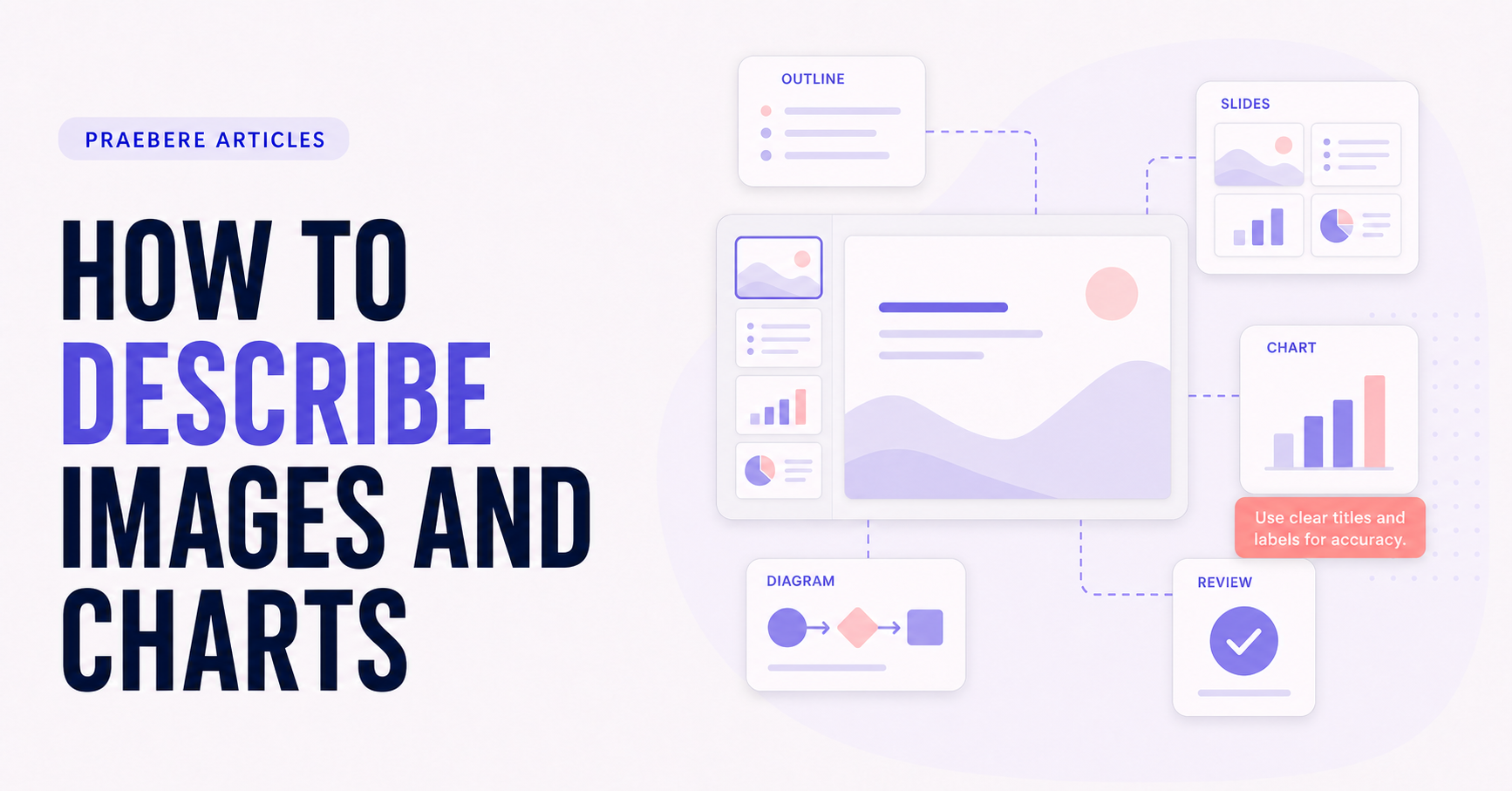
The practical decisions behind “How to Describe Images and Charts”
A reader can understand “How to Describe Images and Charts” more clearly by first looking at “Describe the purpose, not every visible pixel.” Accessibility depends on structure as well as appearance.
The practical challenge begins when general advice meets real content, real constraints, and a real audience. Can every viewer perceive the same meaning, follow the intended order, and operate the final format? Which barriers remain invisible when a presentation is reviewed only visually and only on the author’s device? The sections ahead use these questions to move from the central idea to concrete decisions, technical criteria, and an applied example.
Describe the purpose, not every visible pixel
Ask why the image is present. A functional icon needs its action, an informative photograph needs the relevant context, and a decorative image usually needs no spoken or screen-reader description.
Avoid repeating adjacent captions and do not begin every alternative with “image of.” Include text embedded in an image when that text is essential and unavailable elsewhere.
For charts, state the conclusion and supporting pattern
Name the chart topic, measures, units, period, major trend or comparison, notable exceptions, and source. Provide a data table or longer description when exact values are needed for the task.
Do not overstate causality or precision. Mention missing data, uncertainty, or scale choices when they materially affect interpretation.
Provide layered descriptions and access to the data
Use short alternative text for the image’s immediate purpose and place a longer description nearby or through a clearly identified link when the visual is complex. For a process diagram, describe the starting point, major stages, branches, and outcome. For a photograph, include only details that support the surrounding argument; identity attributes should be mentioned only when relevant and known.
For a chart, lead with the topic and takeaway, then state measures, units, time span, important comparisons, extrema, exceptions, and uncertainty. Supply the underlying data in an accessible table when exact values matter. Preserve source and methodology, and avoid wording that claims causality when the visualization shows only association.
- Match description length to purpose and complexity
- Do not duplicate a complete adjacent caption
- State chart pattern, scale, exceptions, uncertainty, and source
- Provide an accessible table or structured data for exact values
Technical implementation notes
Accessibility depends on structure as well as appearance. Use semantic headings, meaningful reading order, descriptive links, text alternatives, captions, sufficient contrast, keyboard access, visible focus, and redundant cues that do not communicate meaning through color alone.
Automated checks can identify some missing metadata and contrast failures, but they cannot judge logical reading order, caption accuracy, useful alternative text, or task usability. Test the exported format with relevant assistive technologies and representative users. The most relevant concepts here are describe images, chart alt text, accessible data visualization. Define them when first used and apply each term consistently to an observable element, rule, or outcome.
- Structure and reading order are meaningful
- Color is not the only carrier of information
- Media has accurate synchronized alternatives
- Export is tested with keyboard and assistive technology
Worked example: How to Describe Images and Charts
Imagine a recorded quarterly update containing a chart, narration, and webcam video. Give the page a logical heading structure, place objects in meaningful reading order, describe the chart's conclusion and relevant values, review captions against the audio, and provide a transcript or equivalent data table.
Then navigate the exported result using only a keyboard and a screen reader. If the chart is announced before its heading, controls have no names, or captions change a technical term, correct the source and retest the final export—not only the editor.
Conclusion
Rather than reducing “How to Describe Images and Charts” to a checklist, the article linked describe the purpose, not every visible pixel, for charts, state the conclusion and supporting pattern, and provide layered descriptions and access to the data. That combination explains not only what to do, but also why the choices matter and how to inspect the outcome.
We believe the practical standard should be clear: accessibility belongs in the structure, media, interaction, and export from the first draft. A presentation is not successful if part of its audience cannot reach the same meaning or controls.
Create the visual journey
Turn your process into a presentation
Build the diagram, choose the sequence, add narration or webcam video, and preview the camera movement in your browser.
Open Praebere