
A closer look at the decisions behind “How Much Text Should You Put on Each Slide”
In practice, “How Much Text Should You Put on Each Slide” succeeds or fails on decisions introduced in “There is no universal word limit.” Treat the presentation as an information system: every element needs a purpose, a place in the reading order, and a relationship to the decision or idea being explained.
The practical challenge begins when general advice meets real content, real constraints, and a real audience. What should the audience notice first, and does the visual system make that priority unmistakable at the real viewing size? Which choices improve hierarchy and readability, and which ones merely make the slide look decorated? The sections ahead use these questions to move from the central idea to concrete decisions, technical criteria, and an applied example.
There is no universal word limit
The right amount of text depends on what the slide must do. A title that introduces a decision may need only one sentence, while a technical reference slide may require labels, conditions, and definitions. A fixed word count cannot account for audience knowledge, screen size, or how long the slide remains visible.
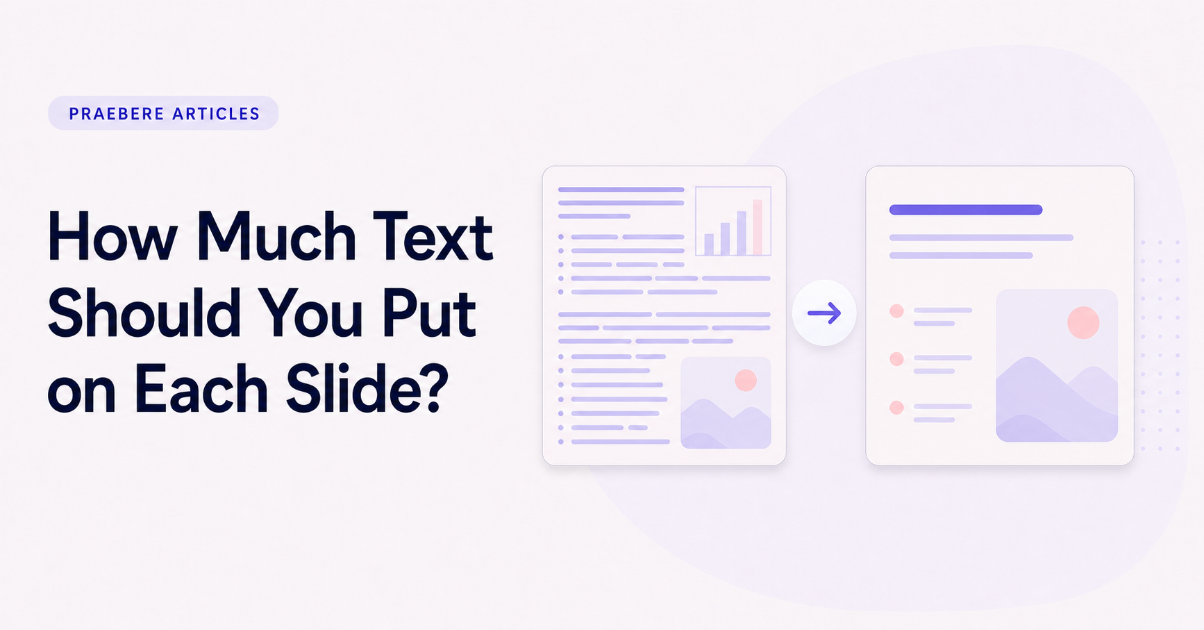
The better question is whether every visible word helps the audience understand, remember, or use the information. Text that repeats the narration, fills space, or explains something the visual already makes clear can usually be removed or moved elsewhere.
Give every text element a role
Separate the title, supporting explanation, labels, and source information. The title should express the main point rather than name a broad topic. Supporting text adds the minimum context needed to interpret the visual, while labels identify parts that would otherwise be ambiguous.
When one paragraph contains several roles, split it before shortening it. A sentence may become the title, a condition may become a note, and the remaining explanation may belong in narration or presenter notes.
- Title: the main message.
- Support: essential context or qualification.
- Labels: names, values, and categories.
- Reference: source, definition, or condition needed later.
Design for the available reading time
A live audience cannot read a dense slide and listen to a different explanation at the same time. If text must be read carefully, pause the narration or allow enough time for it. If the speaker will explain the detail, keep the screen focused on the structure and key terms.
Recorded and self-guided presentations may support more reference text because viewers can pause or revisit a frame. Even then, hierarchy matters. The audience should recognize the main point before deciding whether to read the detail.
Reduce text without removing meaning
Cut repeated introductions, vague qualifiers, and phrases that do not change the message. Replace abstract wording with specific verbs and nouns. However, preserve conditions, units, dates, and exceptions when they affect the conclusion.
When a slide remains crowded after editing, divide the explanation across multiple moments. Progressive disclosure is better than shrinking the type until it becomes difficult to read. Each frame can carry one part of the reasoning while the sequence preserves the complete idea.
Evaluate text inside the complete sequence
Read only the slide titles in order. They should form a coherent outline. Then inspect each slide at the intended display size and check whether supporting text remains legible without competing with diagrams, images, or movement.
In Praebere, shape titles can carry the main action or idea while smaller text provides support. Narration or webcam video can add context as the camera follows the diagram, allowing the visible text to stay concise without removing information from the presentation.
Technical implementation notes
Treat the presentation as an information system: every element needs a purpose, a place in the reading order, and a relationship to the decision or idea being explained. Define a grid, type scale, spacing scale, color roles, and reusable components before polishing individual screens.
Test the complete sequence at the real viewing size. Check hierarchy at a glance, line length, contrast, alignment, source accuracy, narration timing, and whether the audience can identify the main point without relying on decoration. The most relevant concepts here are text on slides, how much text per slide, presentation text. Define them when first used and apply each term consistently to an observable element, rule, or outcome.
- One primary message per visual step
- Consistent grid, spacing, type, and color roles
- Evidence and labels remain legible at delivery size
- Reading order still works without animation
Worked example: How Much Text Should You Put on Each Slide?
Suppose a project update contains a title, one key number, a supporting sentence, and three milestones. Place the content on a shared grid, use one alignment axis, assign the largest type to the conclusion, keep explanatory text at a readable measure, and use spacing to separate the number from the milestones.
Project the slide at the intended size and stand at the back of the room. If the supporting text disappears, the milestones compete with the conclusion, or alignment changes between slides, adjust the system rather than patching isolated objects.
Conclusion
From there is no universal word limit to evaluate text inside the complete sequence, the discussion treated “How Much Text Should You Put on Each Slide?” as a set of connected decisions. The example demonstrated how those decisions influence the result when real constraints and edge cases appear.
Our editorial position is straightforward: professional presentation design is a system of hierarchy, alignment, spacing, typography, contrast, and editorial restraint. Every visual choice should make the message easier to find and interpret at the real delivery size.
Create the visual journey
Turn your process into a presentation
Build the diagram, choose the sequence, add narration or webcam video, and preview the camera movement in your browser.
Open Praebere