
The practical decisions behind “How to Choose Fonts for Presentations”
A reader can understand “How to Choose Fonts for Presentations” more clearly by first looking at “Begin with readability at presentation distance.” Treat the presentation as an information system: every element needs a purpose, a place in the reading order, and a relationship to the decision or idea being explained.
The practical challenge begins when general advice meets real content, real constraints, and a real audience. What should the audience notice first, and does the visual system make that priority unmistakable at the real viewing size? Which choices improve hierarchy and readability, and which ones merely make the slide look decorated? The sections ahead use these questions to move from the central idea to concrete decisions, technical criteria, and an applied example.
Begin with readability at presentation distance
A font that looks refined on a laptop may become difficult to read on a projected slide or small video frame. Test type at the actual display size and consider letter shapes, spacing, stroke contrast, and clarity at smaller sizes.
Avoid judging a font only by a sample word. Create a realistic title, a short paragraph, labels, and numbers. Some typefaces work well for large headings but become tiring or ambiguous in supporting text.
Use one family well before adding another
A versatile font family with several weights can provide enough contrast for titles, supporting text, and labels. This approach creates consistency and reduces the chance of combinations that compete with one another.
If you use two families, give each a stable role. For example, one may handle headings and the other body text. Choose fonts with complementary proportions and clearly different functions rather than two styles that look almost, but not quite, the same.
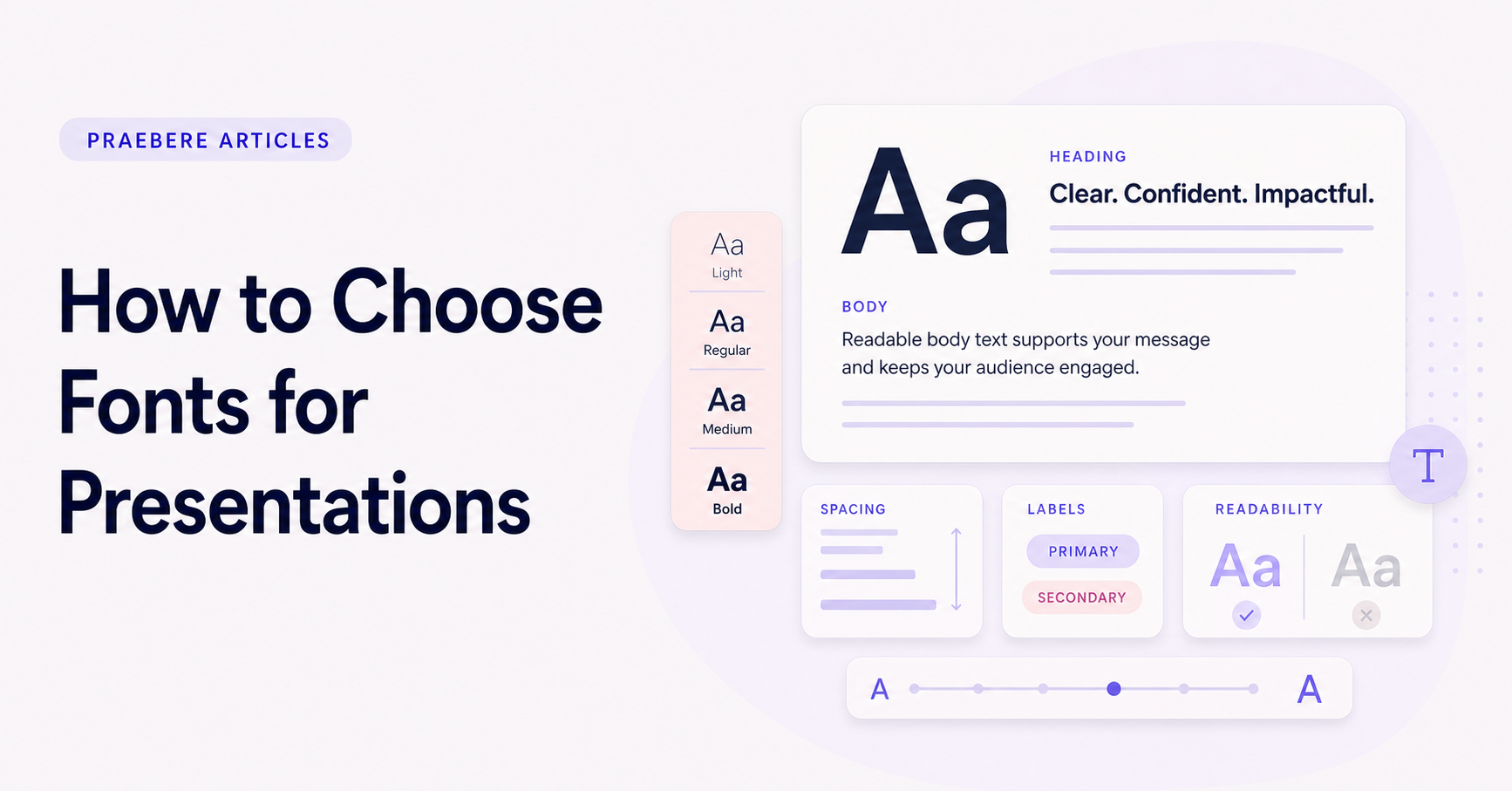
- Regular for body text.
- Medium or semibold for labels.
- Bold for short titles or emphasis.
- Italic only when it has a specific role.
Build hierarchy with more than font size
Size is only one typographic signal. Weight, color, capitalization, line spacing, and position also shape hierarchy. Combine a few of these signals consistently instead of assigning a unique style to every text element.
Make the difference between levels noticeable. A title that is only slightly larger than the body can look accidental. At the same time, avoid making supporting text so small that it works only when the slide is viewed up close.
Control line length and spacing
Wide text boxes create long lines that are harder to scan. Use shorter blocks and break lines at natural points, especially in large titles. Adjust line spacing so multiple lines remain connected without appearing compressed.
Leave enough space between text and other elements. Typography is part of the layout, not content placed into whatever area remains. Consistent margins and alignment make the presentation feel deliberate even before color or imagery is added.
Test fonts in every output format
Confirm that the chosen fonts load correctly on the devices and export formats you plan to use. A fallback font can change line breaks, spacing, and the size of shapes. When portability matters, prefer reliable web-safe or properly embedded fonts and inspect the final result.
In Praebere, typography appears inside shapes as the camera moves and zooms through the diagram. Check both the complete board and close framing, keeping titles bold and supporting text slightly smaller. Preview the exported presentation to make sure the hierarchy remains readable throughout the sequence.
Technical implementation notes
Treat the presentation as an information system: every element needs a purpose, a place in the reading order, and a relationship to the decision or idea being explained. Define a grid, type scale, spacing scale, color roles, and reusable components before polishing individual screens.
Test the complete sequence at the real viewing size. Check hierarchy at a glance, line length, contrast, alignment, source accuracy, narration timing, and whether the audience can identify the main point without relying on decoration. The most relevant concepts here are fonts for presentations, presentation typography, choose presentation fonts. Define them when first used and apply each term consistently to an observable element, rule, or outcome.
- One primary message per visual step
- Consistent grid, spacing, type, and color roles
- Evidence and labels remain legible at delivery size
- Reading order still works without animation
Worked example: How to Choose Fonts for Presentations
Suppose a project update contains a title, one key number, a supporting sentence, and three milestones. Place the content on a shared grid, use one alignment axis, assign the largest type to the conclusion, keep explanatory text at a readable measure, and use spacing to separate the number from the milestones.
Project the slide at the intended size and stand at the back of the room. If the supporting text disappears, the milestones compete with the conclusion, or alignment changes between slides, adjust the system rather than patching isolated objects.
Conclusion
Rather than reducing “How to Choose Fonts for Presentations” to a checklist, the article linked begin with readability at presentation distance, use one family well before adding another, build hierarchy with more than font size, control line length and spacing, and test fonts in every output format. That combination explains not only what to do, but also why the choices matter and how to inspect the outcome.
Our judgment after considering the full article is that professional presentation design is a system of hierarchy, alignment, spacing, typography, contrast, and editorial restraint. Every visual choice should make the message easier to find and interpret at the real delivery size.
Create the visual journey
Turn your process into a presentation
Build the diagram, choose the sequence, add narration or webcam video, and preview the camera movement in your browser.
Open Praebere