
The practical decisions behind “How to Design Interfaces for Visual Editors”
Real constraints reveal what “How to Design Interfaces for Visual Editors” demands, beginning with the issue in “Treat the canvas as the primary workspace.” Model the user, task, environment, device, and failure cost before choosing controls.
The practical challenge begins when general advice meets real content, real constraints, and a real audience. Can a first-time user predict the result of an action, see the current state, and recover from a mistake? Does the same task remain understandable with touch, keyboard, zoom, latency, and a smaller screen? The sections ahead use these questions to move from the central idea to concrete decisions, technical criteria, and an applied example.
Treat the canvas as the primary workspace
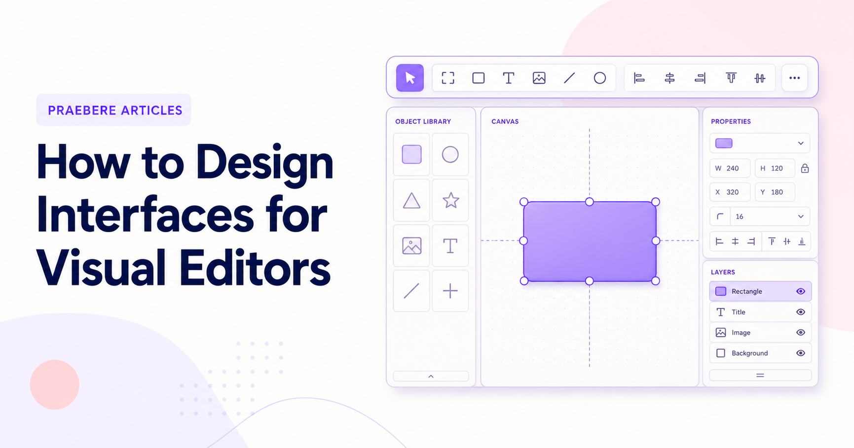
A visual editor usually combines a canvas, tools for creating content, and controls for changing selected elements. The canvas needs enough space to support composition while the surrounding interface makes the next useful action easy to find. Permanent panels should earn the space they occupy.
Keep navigation and editing separate in the user's mind. Panning, zooming, selecting, and manipulating objects can conflict when their boundaries are unclear. Visible cursor changes, selection outlines, and consistent gestures help users predict which action will occur.
Organize controls around objects and tasks
Creation tools can be grouped by what they add, such as text, shapes, connectors, and media. Property controls should respond to the current selection and present the most relevant settings first. This reduces searching and avoids showing options that cannot affect the current object.
Contextual controls should not move unpredictably. Keep common properties in stable locations and reveal specialized groups within that structure. Users should be able to develop spatial memory for frequently used actions.
- Creation tools grouped by content type.
- Selection properties grouped by purpose.
- Stable locations for frequent commands.
- Advanced options disclosed only when relevant.
Make direct manipulation precise and reversible
Dragging, resizing, rotating, and connecting should feel immediate. Handles need adequate target size, guides should appear at useful alignment points, and snapping should assist without making fine adjustments impossible. Numeric controls can complement direct manipulation when precision matters.
Preview the result during the interaction whenever performance allows. If an operation is expensive, show a lightweight approximation and apply the final result when the gesture ends. Undo should treat one continuous gesture as one recoverable action.
Design for selection in crowded documents
Selection is simple on an empty canvas and difficult when objects overlap, nest, or become small at a distant zoom. Support marquee selection, additive selection, cycling through overlapping elements, and a layer view when the document structure requires it.
The interface should distinguish the selected object, its container, and any multi-selection boundary. Hiding every other visual cue may reduce clutter, but removing too much context makes it difficult to understand where the object belongs.
Support the complete workflow and multiple input methods
A visual editor should work with keyboard and pointer input, and touch layouts need targets, gestures, and spacing appropriate to fingers. Critical actions should not depend only on hover. Accessibility also includes readable contrast, visible focus, semantic labels, and alternatives to precise dragging.
Praebere connects canvas editing to a video presentation sequence. Its interface therefore needs to make object creation, ordering, camera framing, narration, preview, and export feel like parts of one workflow. Designing around the complete outcome prevents the editor from becoming a collection of unrelated tools.
Technical implementation notes
Model the user, task, environment, device, and failure cost before choosing controls. Direct manipulation needs visible affordances, immediate feedback, forgiving hit targets, keyboard equivalents, undo, and state that remains understandable without relying on memory.
Evaluate representative tasks with observable success criteria such as completion rate, time, errors, recoveries, and assistance required. Include touch, keyboard, zoom, small screens, latency, empty states, invalid input, and interrupted work in the test plan. The most relevant concepts here are visual editor interface design, canvas editor UX, diagram editor interface. Define them when first used and apply each term consistently to an observable element, rule, or outcome.
- The current state and available action are visible
- Errors are preventable and recoverable
- Keyboard and touch paths reach the same outcome
- Testing uses realistic content and devices
Worked example: How to Design Interfaces for Visual Editors
Imagine a first-time touch user placing a shape, editing its title, connecting it, and undoing an accidental move. The element needs a large enough hit target, visible selected state, movement threshold that differs from a tap, alignment feedback, auto-scroll near edges, and an undo action that restores position and connections.
Test the same task with mouse, touch, keyboard, zoom, and a small screen. Record errors and recovery, not just completion. If users repeatedly open the wrong property group or cannot predict the drop result, change the interaction model and test again.
Conclusion
The article’s main threads—treat the canvas as the primary workspace, organize controls around objects and tasks, make direct manipulation precise and reversible, design for selection in crowded documents, and support the complete workflow and multiple input methods—lead to a shared lesson: the quality of “How to Design Interfaces for Visual Editors” can be tested. Technical criteria and a realistic example make strengths, omissions, and consequences visible.
Our editorial position is straightforward: good interaction design makes state, consequences, and recovery understandable across mouse, keyboard, and touch. The interface should consume less attention than the creative problem the user is trying to solve.
Create the visual journey
Turn your process into a presentation
Build the diagram, choose the sequence, add narration or webcam video, and preview the camera movement in your browser.
Open Praebere