
Editorial guide
A practical and theoretical guide to presentation storytelling, visual hierarchy, color psychology, slide design, and audience engagement.
1. Introduction: Every Slide Already Tells a Story
A slide is never neutral. Before an audience reads a headline or studies a chart, it has already received a message from the visual surface: what appears important, what feels uncertain, what belongs together, what has been excluded, and where the eye should move next. A crowded slide suggests complexity or confusion. A large photograph can create intimacy, scale, or urgency. A sudden shift from muted gray to saturated red can make a problem feel immediate. Even a blank space can communicate confidence, pause, or anticipation.
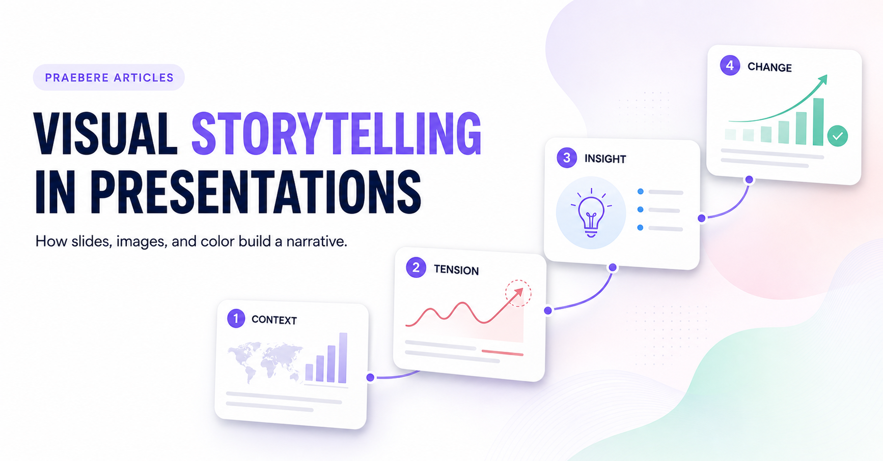
This is why visual storytelling in presentations is not simply the practice of adding attractive pictures to a sequence of slides. It is the deliberate construction of meaning through images, color, typography, composition, charts, and sequence. In a strong visual narrative, the audience does not merely receive information. It experiences a progression: first it understands the current situation, then it recognizes a conflict or gap, then it sees evidence, discovers an insight, imagines a better future, and finally understands what action is required.
That progression matters because modern audiences face a paradox. They have access to more information than any previous generation, yet they often have less time and attention available for understanding it. Business presentations, educational decks, project proposals, sales pitches, strategy reviews, and conference talks compete with notifications, meetings, dashboards, and constant context switching. A presentation that behaves like a document - dense, static, and exhaustive - asks the audience to perform too much interpretation on its own. A presentation that behaves like a story helps the audience decide what matters and why.
The value of learning presentation storytelling therefore extends beyond design. It improves the way people explain complex systems, teach difficult ideas, advocate for change, share evidence, and make collective decisions. When a public-health team makes risk understandable, when a teacher turns an abstract process into a sequence students can follow, or when a project leader shows why a hidden bottleneck deserves investment, visual storytelling becomes a form of social infrastructure. It converts information into shared understanding.
This article explores that infrastructure in depth. It will trace the historical roots of visual narrative, explain the cognitive and perceptual theories behind effective slide design, examine how images and colors carry meaning, show how an entire deck can be structured as a story, and end with a practical example. The central question is simple but powerful: if every presentation is already telling a story, is it telling the story you intended?
2. From Cave Walls to Digital Slide Decks
Visual narrative existed before written narrative
Long before writing systems became widespread, people recorded animals, movement, danger, ritual, and memory through visual marks. Cave paintings did more than reproduce the appearance of the world. Their placement, repetition, scale, and grouping created relationships between subjects. They transformed isolated images into scenes and scenes into possible sequences. The precise purpose of many early images remains debated, but their existence proves that humans have long used visual form to preserve and transmit meaning.
Across later civilizations, visual stories became more explicit. Egyptian reliefs organized events in registers. Greek pottery compressed myths into recognizable scenes. Trajan's Column turned military campaigns into a continuous spiral narrative. Medieval manuscripts joined image, ornament, and text, while the Bayeux Tapestry used a long sequence of embroidered scenes and brief captions to recount the Norman conquest of England. These works demonstrate a principle still relevant to presentation design: viewers understand a story not only from individual images but from the relationships between images across space and time.
The arrival of diagrams, charts, and projected images
As science, navigation, administration, and commerce expanded, visual communication increasingly included maps, diagrams, timelines, and statistical graphics. These forms did not merely illustrate stories; they made relationships visible. A map could show distance and territory. A timeline could show causality and change. A chart could reveal a pattern that was difficult to detect in a table of numbers. In the nineteenth and twentieth centuries, posters, newspapers, film, advertising, and information graphics refined the ability to guide attention at scale.
Presentation technology added a new dimension: controlled sequence. Lantern slides, photographic slides, overhead transparencies, and eventually digital presentation software allowed a speaker to decide exactly when an image would appear. This transformed visual storytelling from a static field into a timed experience. The presenter could establish a context, withhold information, reveal evidence, compare states, and create anticipation. The modern slide deck inherited techniques from theater, cinema, graphic design, education, and information visualization.
Why the digital slide often forgot its narrative roots
Digital tools made slide creation faster, but they also made it easy to confuse content storage with communication. Templates encouraged users to fill placeholders. Bullet lists became a default. Charts were pasted from spreadsheets without a clear message. Images were added as decoration. The result was often a deck that contained a great deal of information but offered little narrative direction.
Visual storytelling restores the original advantage of the presentation format: the ability to arrange meaning over time. A good slide deck is not a report divided into pages. It is a designed journey in which each visual choice prepares the audience for the next idea.
3. What Visual Storytelling Means in Presentations
Visual storytelling is often defined loosely as telling stories with images. In presentations, that definition is too narrow. A presentation is a multimodal system. Meaning emerges from the interaction of spoken language, written language, imagery, color, typography, data, spatial arrangement, and time. A strong visual story coordinates these channels so they reinforce one another rather than compete.
The phrase 'from one state of understanding to another' is essential. A deck has a story when something changes. The change may be external: revenue declined, a market shifted, a process failed, or a new opportunity appeared. It may be internal: the audience begins with one interpretation and ends with another. In the best presentations, both changes happen together. The presenter describes a changing reality while also changing the audience's mental model of that reality.
The three scales of presentation storytelling
Visual storytelling operates simultaneously at three scales. At the macro scale, the entire presentation has an arc. At the middle scale, groups of slides form chapters or arguments. At the micro scale, each slide contains its own hierarchy and internal path for the eye. Weak presentations usually address only one scale. They may have a compelling opening but confusing slides, or elegant individual slides that do not form a coherent journey.
| Term | What it means in a presentation |
|---|---|
| Narrative arc | The overall movement from context through tension, insight, resolution, and action. |
| Story beat | A single moment that changes what the audience knows, feels, or expects. In a deck, one slide often represents one beat. |
| Visual hierarchy | The order in which elements are perceived, created through size, contrast, color, position, spacing, and typography. |
| Visual motif | A repeated image, shape, color, or symbol that connects distant parts of the presentation. |
| Framing | The way a subject is cropped, positioned, or contextualized to influence interpretation. |
| Progressive disclosure | Revealing information in stages so the audience processes one relationship at a time. |
| Data story | A narrative that combines evidence, visual representation, and interpretation to communicate an insight. |
| Call to action | The decision, behavior, or next step the presentation is designed to produce. |
Information is not yet a story
A collection of facts can be accurate and still fail to become a story. Consider the statement: 'Customer onboarding takes nine days, involves four teams, and produces a 22 percent abandonment rate.' This is information. It becomes narrative when the presenter establishes an expectation, reveals a gap, identifies the cause, shows the human or business consequence, and proposes a different future. The numbers remain the same, but their arrangement creates tension and meaning.
This distinction prevents a common error in presentation design: trying to make weak structure look better through visual polish. Better colors and photographs cannot repair an argument that lacks direction. Visual storytelling begins with a narrative decision, then uses design to make that decision perceptible.
4. The Cognitive Foundations of Visual Narrative
Words and pictures can build connected mental models
Research in multimedia learning has repeatedly examined how people learn from words and pictures. The central multimedia principle is that, under appropriate conditions, people can understand explanations better when relevant words and visuals are combined than when words are used alone. The benefit does not come from adding more media indiscriminately. It comes from helping the audience build connections between verbal and visual representations.
For a presentation designer, the implication is practical. A diagram should not repeat a paragraph in another form. It should reveal structure the paragraph cannot show easily. An image should not merely occupy empty space. It should provide context, emotion, scale, identity, or evidence. A chart should not display every available number. It should make the intended relationship visible.
Dual coding: two forms of representation
Dual coding theory proposes that verbal and nonverbal information can be represented through partly distinct systems. In everyday terms, an idea may be encoded as language and also as imagery. When these forms are meaningfully connected, they can provide more routes for recall and understanding. In a slide deck, this does not justify pairing every sentence with an icon. It suggests that a carefully chosen visual model can make an abstract concept more memorable because the audience can remember both the words and the visual relationship.
Cognitive load: the cost of unnecessary interpretation
Working memory is limited. A slide that presents dense text, multiple charts, decorative icons, a complex background, and a speaker's narration at the same time forces the audience to decide what deserves attention. Much of its mental effort is spent managing the interface rather than understanding the idea. Visual storytelling reduces that unnecessary load by simplifying choices, grouping related elements, and revealing information in a controlled order.
Simplicity, however, should not be confused with superficiality. A simple slide can contain a sophisticated idea if the relationship is clear. The purpose is not to remove complexity from the subject; it is to prevent the design from creating additional complexity.
Gestalt principles: how viewers organize a slide
Gestalt psychology explored how people perceive organized wholes rather than unrelated fragments. Several Gestalt principles are directly useful in presentation design. Elements placed close together are perceived as related. Similar shapes or colors appear to belong to the same category. Connected elements form a unit. A continuous line encourages the eye to follow a path. Figure-ground contrast separates the subject from its background. Closure allows the mind to complete incomplete forms.
These principles matter because audiences do not read a slide element by element in a purely rational sequence. They first perceive groups, contrast, boundaries, and dominant forms. A designer who ignores perceptual organization may create accidental relationships. Two unrelated labels placed close together may seem connected. Five items in the same color may appear to share a category. A weak figure-ground contrast may make the most important idea feel secondary.
Preattentive attributes: what the eye notices first
Some visual features are detected rapidly, before deliberate analysis. Differences in color, size, orientation, position, and shape can immediately separate one element from many others. These preattentive attributes are powerful tools for storytelling because they can direct attention without requiring the audience to search.
Imagine a chart with twelve gray bars and one purple bar. The purple bar becomes the protagonist of the visual. The audience knows where to look before reading the title. If the highlighted bar represents the core insight, the design supports the narrative. If the color is decorative, it creates false emphasis. Every strong contrast is a promise that the contrasted element matters.
5. The Narrative Architecture of a Slide Deck
Start with the audience, not the topic
A topic is not a story. 'Cybersecurity strategy,' 'Quarterly results,' 'Climate change,' or 'Product roadmap' describes subject matter, but it does not define a journey. A presentation story begins when the designer identifies the audience's current beliefs, concerns, incentives, and level of knowledge. The audience is not a passive container waiting to receive content. It is the central participant whose understanding must change.
A practical planning question is: what does the audience believe before the presentation, and what should it believe afterward? The difference between those two states is the narrative destination. Every slide should help cross that distance.
The audience as protagonist
In fiction, the protagonist faces a challenge and changes through the story. In a presentation, the organization, customer, community, learner, or decision-maker often occupies that role. A company strategy deck is stronger when it shows what the organization must overcome, not when it merely celebrates the presenter. A sales presentation is stronger when the customer recognizes its own problem and future, not when the vendor becomes the hero of every slide.
A six-part structure for presentation storytelling
- Promise or orientation: establish the subject and give the audience a reason to care. What important question will the presentation answer?
- Current state: show the world as it exists now. Define the baseline, expectation, or familiar pattern.
- Tension: introduce a gap, contradiction, risk, obstacle, or unmet need. Without tension, information has no direction.
- Evidence and insight: reveal what is driving the situation. Move from symptoms to meaning.
- Future state: make the alternative visible. Show what changes if the insight is acted upon.
- Action: translate the future into a decision, commitment, experiment, or next step.
One slide, one narrative job
The familiar advice 'one idea per slide' is useful but incomplete. A more precise rule is: one narrative job per slide. A slide may contain several pieces of evidence if they perform the same job. For example, three customer quotes may collectively establish frustration. A process diagram may contain many steps but perform one job: reveal the bottleneck. The key is not the number of elements; it is whether the audience can describe why the slide exists.
Headlines should advance the story
Generic labels such as 'Market Analysis,' 'Results,' or 'Next Steps' identify categories but do not communicate meaning. Narrative headlines state the conclusion or change: 'The market is expanding, but our most profitable segment is shrinking.' 'Most delays occur before engineering begins.' 'A four-week pilot can remove two of the three handoffs.' When slide titles form a readable sequence, the skeleton of the story becomes visible even without the body content.
Create tension without manufacturing drama
Presentation storytelling does not require exaggeration. Tension can arise from a factual contrast: expectation versus reality, current state versus desired state, investment versus return, speed versus quality, or local optimization versus system performance. Ethical tension clarifies a real trade-off. Manipulative drama hides uncertainty, distorts scale, or uses fear to force agreement. Strong visual storytelling makes evidence easier to understand; it should not make weak evidence appear stronger than it is.
6. How Images Tell Stories
Images must perform a narrative function
An image can establish place, reveal scale, show a person affected by a decision, provide evidence, create a metaphor, or mark a transition. The question is not whether a slide should contain an image, but what work the image performs. Decorative images often compete with the message because they introduce visual information without adding narrative information.
A photograph of a generic handshake may signal business, but it rarely explains a specific relationship. A real image of a technician working around a poorly placed machine can reveal an operational problem immediately. A satellite image can make geographic scale visible. A before-and-after pair can embody change. A sequence of customer screenshots can expose friction. Specificity creates credibility.
Framing changes meaning
The same photograph can tell different stories depending on how it is cropped. A wide frame emphasizes environment and scale. A close crop emphasizes emotion or detail. Placing a person at the edge of the frame can create tension or direction. Leaving visual space in front of a person's gaze creates room for the slide's next idea; placing text behind the gaze can make the composition feel resistant.
Directionality guides the eye
Images contain vectors: a road, an arm, a face, a beam of light, a chart trend, or the implied motion of an object. These lines influence where the viewer looks. A well-composed slide aligns those vectors with the reading path. If a subject looks toward the headline, the image helps connect emotion and language. If the subject looks away from the message, the slide may feel visually divided.
Continuity turns separate slides into a visual narrative
A deck feels coherent when images share a visual logic. This does not mean using the same photograph repeatedly. It may mean consistent lighting, perspective, crop style, illustration language, or subject matter. A recurring visual motif - a path, bridge, doorway, map, thread, or set of cards - can connect chapters and help the audience remember the larger structure.
Metaphor can compress abstract ideas
Visual metaphors translate an unfamiliar or abstract idea into a familiar structure. A bottleneck can represent constrained throughput. A bridge can represent transition. Layers can represent architecture. A compass can represent strategic direction. Metaphors are powerful because they compress meaning, but they must fit the concept. A decorative rocket on every growth slide adds energy without explanation; a carefully designed trajectory can show phases, velocity, and constraints.
Use people responsibly
Images of people create immediate social meaning. Faces attract attention, expressions suggest emotion, and context signals identity and power. Use authentic, relevant images whenever possible. Avoid turning people into visual symbols without respecting their reality. In presentations about communities, employees, patients, or customers, the image should support dignity and agency rather than reduce the subject to a problem the presenter will solve.
7. How Color Tells Stories
Color is one of the fastest ways to create hierarchy and emotional direction, but it is also one of the most frequently misused elements in slide design. Many presentations treat color as a brand requirement or a way to make slides more lively. Visual storytelling treats color as a language with syntax, repetition, contrast, and change.
Four narrative roles of color
- Classification: consistent colors show that elements belong to the same category, team, stage, or concept.
- Emphasis: a distinct color identifies the element the audience should notice first.
- State: colors indicate conditions such as current, risky, blocked, approved, or completed.
- Progression: the palette changes across the deck to make movement from tension to resolution perceptible.
Color psychology is contextual, not universal
Design discussions often assign fixed emotions to colors: blue means trust, red means danger, green means growth, and so on. These associations can be useful starting points, but they are not universal laws. Meaning depends on culture, industry, context, saturation, brightness, surrounding colors, and prior use inside the presentation. Red may signal error, urgency, financial loss, celebration, or political identity. A responsible designer builds meaning through consistent use rather than assuming an automatic emotional response.
Build a semantic palette
A semantic palette assigns roles before assigning colors. For example: neutral for context, warm accent for tension, primary brand color for insight, green for validated improvement, and dark navy for stable structure. Once established, these roles should remain consistent. If purple means 'recommended solution' on one slide, it should not mean 'legacy problem' on another.
Use color progression across the deck
Color can carry the narrative arc. The opening may use restrained neutral tones to establish reality. The problem chapter may introduce a warmer, more urgent accent. The insight may use a distinctive focal color. The future state may become lighter or more open. This progression works best when subtle. A presentation should not resemble a traffic light sequence; it should allow the audience to feel that the visual world has changed as the argument changes.
Contrast, readability, and accessibility
Color storytelling fails when viewers cannot distinguish or read it. Text must maintain strong contrast against its background, especially when projected in bright rooms or viewed on small screens. Color should not be the only signal for meaning; labels, icons, line styles, patterns, or position should reinforce it. This makes the presentation more inclusive for people with color-vision differences and more robust in poor viewing conditions.
Accessibility is not separate from storytelling. A story that some members of the audience cannot perceive is structurally incomplete. Clear contrast, readable type, restrained palettes, and redundant cues improve communication for everyone.
8. How Composition Directs Attention
Visual hierarchy creates a reading path
Every slide asks the audience to look somewhere first. Visual hierarchy answers where. Size, position, contrast, color, whitespace, typography, and shape determine the order of perception. The strongest element should usually correspond to the slide's narrative job. If the key message is a small label beneath a large decorative image, the hierarchy contradicts the story.
Scale communicates importance and distance
Large elements appear important, close, or dominant. Small elements appear secondary, distant, or numerous. Scale can dramatize a gap, compare states, or establish a protagonist. A single large number can turn an abstract metric into a moment. A tiny human figure beside an enormous structure can communicate scale more effectively than a sentence.
Whitespace controls pace
Whitespace is not unused space. It separates ideas, creates emphasis, and gives the audience time to process. Dense slides feel fast and demanding. Open slides feel deliberate. A sequence can use this rhythm strategically: a detailed evidence slide may be followed by a simple insight slide, creating a visual pause that allows meaning to settle.
Alignment creates invisible structure
Consistent alignment reduces visual noise because the audience can predict where information will appear. Grids create continuity across slides, even when the content changes. Breaking the grid can then become a meaningful event. An element that suddenly crosses a boundary, fills the frame, or shifts position will attract attention because the presentation has established a stable visual expectation.
Typography is a narrative voice
Typography influences tone before the words are understood. A heavy condensed headline can feel urgent and declarative. A light geometric typeface can feel modern and open. A serif can suggest editorial authority or tradition. More importantly, typographic hierarchy distinguishes claim, evidence, annotation, source, and action. Consistent roles help the audience know how to read each slide.
Repetition creates memory
Repeated layouts, colors, labels, and motifs reduce the cost of orientation. The audience recognizes the visual grammar and can focus on what changed. Repetition also makes comparison easier. If three options use the same structure, differences become visible. If every slide uses a different composition, the audience spends time relearning the interface.
9. Data Storytelling Inside Presentations
Data storytelling combines evidence, visual representation, and narrative interpretation. It is not the practice of turning every chart into a dramatic story. It is the practice of helping the audience see what the data means, why it matters, and what should happen next.
Begin with the decision, not the chart type
A common workflow begins with available data and asks which chart can display it. A storytelling workflow begins with the audience's question. Are we showing change over time, a comparison, distribution, composition, relationship, or process? What conclusion should the audience be able to test? The chart type follows the relationship, and the slide design follows the narrative job.
Highlight the insight, mute the context
Not every data point deserves equal visual weight. Context can be shown in neutral tones while the relevant series, period, threshold, or category receives emphasis. This does not hide data; it organizes attention. Labels and annotations should explain the turning point rather than forcing the audience to decode it alone.
Write the conclusion in the headline
A chart title such as 'Monthly Conversion Rate' describes the data. A narrative headline such as 'Conversion recovered only after the checkout redesign' states the insight. The chart then becomes evidence for the claim. This relationship between headline and visual makes a slide easier to understand quickly and easier to remember later.
Use sequence to explain complex charts
A dense chart may be necessary, but it does not need to appear fully formed. Progressive disclosure can first establish axes and baseline, then introduce the main series, then highlight the anomaly, and finally annotate the insight. The audience sees the same reasoning path the analyst used. Motion is serving explanation, not decoration.
Preserve uncertainty and integrity
A persuasive visual story must remain honest. Truncated axes, misleading areas, selective time ranges, exaggerated color, and omitted uncertainty can create false drama. The purpose of data storytelling is not to make the data agree with a narrative; it is to make the strongest defensible interpretation visible. When uncertainty is important, show it. Confidence intervals, scenarios, ranges, and assumptions can be designed clearly without destroying the story.
10. Motion and Progressive Reveal
Although this article focuses on slides, images, and color, sequence is inseparable from presentation storytelling. Motion should clarify a relationship that static composition cannot reveal as effectively. It can show causality, transformation, hierarchy, flow, or change over time. The most useful question is not "How can this slide move?" but "What should the audience understand only after the next reveal?"
Progressive reveal is particularly effective when the audience needs to compare stages. A process can appear one step at a time. A system diagram can begin with the central service, then add dependencies. A before-and-after composition can preserve the same spatial structure so the transformation is easy to perceive. A chart can reveal the critical period only after the baseline is understood.
Excessive animation weakens narrative continuity by making the interface itself the subject. Transitions should feel like punctuation: a cut creates decisiveness, a dissolve suggests continuity, and a zoom can change scale or context. When every object spins, bounces, or flies, punctuation becomes noise.
11. Common Mistakes That Weaken a Visual Story
Mistake 1: Designing slides before defining the story
Opening presentation software too early encourages local decisions: choose a template, fill a title box, find an image, add a chart. The deck grows slide by slide without a clear arc. Storyboarding with simple sentences or sketches first makes it easier to remove repetition and identify missing logic.
Mistake 2: Using images as background decoration
A full-bleed image can create impact, but only when it supports the claim. A generic city skyline behind a strategy statement adds mood but not meaning. If the image reduces readability or introduces irrelevant associations, it weakens the story.
Mistake 3: Treating brand colors as equal-purpose colors
A brand palette may contain several colors, but a narrative needs hierarchy. Using every brand color on every slide removes emphasis. Select a dominant neutral, a primary narrative accent, and a small number of semantic colors. Brand consistency is stronger when the system is disciplined.
Mistake 4: Placing the conclusion after the evidence
Many slides ask audiences to inspect a complex chart and discover the point. In most business and educational contexts, the headline should state the conclusion and the visual should show why it is true. This respects attention and allows deeper discussion of the evidence.
Mistake 5: Confusing surprise with inconsistency
A story benefits from moments of surprise, but surprise works only against a stable background. If every slide changes fonts, colors, alignment, and image style, nothing feels intentional. Consistency creates the expectation that a meaningful break can later disrupt.
Mistake 6: Ending with a summary instead of a decision
A final slide that repeats the agenda may close the file but not the story. The ending should resolve the central tension and specify the next move. What should the audience remember, decide, approve, try, or discuss? The last visual should make that action feel connected to everything that came before.
12. Practical Example: Redesigning an Onboarding Presentation
Consider a project team that needs approval to redesign customer onboarding. Its original deck contains fourteen slides: an agenda, a process map, several tables, screenshots, survey results, a list of issues, and a budget request. The information is useful, but the audience must build the argument itself. The redesign turns the same material into a seven-slide visual story.
Slide 1 - Establish the promise
Headline: 'New customers should reach their first useful result in one day.' The slide shows a simple path from signup to first value, using a calm blue palette and generous whitespace. This creates an expectation and makes the desired experience visible before the problem appears.
Slide 2 - Reveal the gap
Headline: 'Today, the average customer needs nine days.' The number nine occupies most of the slide. The original one-day promise remains small in the corner, creating immediate contrast. The palette becomes neutral gray with one warm accent on the delay.
Slide 3 - Make the friction visible
Headline: 'Three ownership handoffs create most of the delay.' Instead of showing the complete operational map, the slide isolates the three handoffs. The rest of the process is muted. A warm coral line marks where work stops and waits.
Slide 4 - Humanize the consequence
Headline: 'Customers interpret silence as failure.' A real customer quote appears beside a screenshot of an unanswered status page. The image is not decorative; it shows the experience produced by the process. The presentation moves from operational delay to loss of trust.
Slide 5 - Reveal the insight
Headline: 'The process has many participants, but no single owner.' A central empty node appears among the teams. Purple becomes the focal color, signaling that the presentation has moved from symptoms to diagnosis.
Slide 6 - Show the future state
Headline: 'A guided path removes two handoffs and makes progress visible.' The new process preserves the spatial positions from the earlier map, but unnecessary steps fade away. The palette shifts toward mint green and open space. Because the audience remembers the old structure, the improvement is perceptible rather than merely asserted.
Slide 7 - Ask for a specific action
Headline: 'Approve a four-week pilot for one customer segment.' The slide includes scope, owner, success metric, and review date. It does not introduce new evidence. It converts the resolved story into a decision.
13. A Repeatable Workflow for Visual Storytelling
- Define the audience transformation. Write one sentence describing what the audience believes now and what it should understand or do afterward.
- Identify the central tension. Find the most important gap, contradiction, risk, obstacle, or opportunity. Do not begin with a list of topics.
- Write the story in headlines. Draft one conclusion-oriented sentence per slide before choosing layouts or images.
- Assign one narrative job to each slide. Context, tension, evidence, insight, future, and action are useful labels.
- Choose a visual strategy. Decide whether each slide needs a photograph, diagram, chart, number, comparison, quote, or mostly empty space.
- Create a semantic color system. Assign colors to narrative roles and use them consistently across the deck.
- Design the eye path. Establish what should be seen first, second, and third. Use contrast, size, position, and whitespace to enforce that order.
- Build continuity. Reuse grids, motifs, image styles, and typographic roles so the audience recognizes the visual grammar.
- Use motion only for explanation. Reveal relationships in the order they should be understood.
- Test the story without narration. Review only the slide headlines, then only the visuals. Both should preserve the essential arc.
- Rehearse for timing and attention. Notice where the audience must read while listening, where a pause is needed, and where a slide should be simplified.
- End with an action that resolves the tension. The final slide should answer the question established at the beginning.
A practical slide review checklist
- Can a viewer identify the main point within a few seconds?
- Does the headline communicate a conclusion rather than a category?
- Does every image add context, evidence, emotion, scale, or metaphor?
- Does color have a consistent meaning?
- Is the reading order obvious?
- Can the slide be simplified without losing the central relationship?
- Does this slide prepare the audience for the next one?
- Is the content accessible without relying on color alone?
- Does the visual representation preserve uncertainty and evidence honestly?
14. Why This Matters Beyond Better-Looking Slides
Visual storytelling is sometimes treated as a presentation skill for marketers, designers, or speakers. Its broader importance is the ability to create shared mental models. Complex social and organizational problems often persist because different groups see different fragments. A carefully designed visual narrative can show how those fragments connect.
In education, visual storytelling can make abstract systems visible and help learners connect concepts across time. In science, it can reveal mechanisms, uncertainty, and scale. In public communication, it can turn statistics into comprehensible consequences without abandoning accuracy. In organizations, it can expose process failures, clarify trade-offs, and help people debate the same model rather than separate interpretations.
This power also creates responsibility. Visual hierarchy can guide attention, but it can also hide inconvenient evidence. Emotional images can create empathy, but they can also manipulate. Color can make a risk clear, but it can also exaggerate it. Ethical visual storytelling distinguishes persuasion from distortion. It shows what matters while preserving enough context for the audience to evaluate the claim.
The social contribution of visual storytelling is therefore not that it makes information more entertaining. It makes important information more discussable. It gives groups a visible object around which they can question assumptions, compare futures, and decide what to do.
15. Conclusion: Design the Change, Not Just the Slides
Visual storytelling in presentations is the craft of designing change in the audience's understanding. Its roots extend from early pictorial narratives through manuscripts, maps, diagrams, film, information graphics, and projected images. The modern slide deck combines all of these traditions: it can arrange space like graphic design, control sequence like cinema, explain relationships like a diagram, and guide interpretation like a speaker.
The theory behind effective presentation storytelling is equally interdisciplinary. Multimedia learning explains why connected words and visuals can support understanding. Dual coding highlights the value of complementary verbal and visual representations. Cognitive-load principles remind designers to remove unnecessary interpretive work. Gestalt principles explain how viewers group elements. Preattentive attributes explain how color, size, and position can direct attention before conscious analysis.
In practice, these theories become a set of decisions. Define the audience's transformation. Build a narrative arc around a real tension. Give every slide one job. Use images as evidence, context, emotion, scale, or metaphor. Use color as a consistent system of meaning. Compose each slide so the eye encounters information in the intended order. Use data honestly, motion purposefully, and repetition strategically.
My view is that the best visual storytelling is almost invisible. The audience does not leave saying that every transition was clever or every slide was beautiful. It leaves with a clearer model of the problem, a stronger memory of the insight, and a confident understanding of what should happen next. Beauty can attract attention, but clarity earns trust. A presentation succeeds when design, evidence, and narrative become so aligned that the conclusion feels discovered rather than imposed.
The next time you open a slide tool, resist the urge to begin with a template. Begin with a change. Ask what the audience should see differently by the end. Then design every image, color, chart, headline, and empty space to make that change possible.
Appendix A - SEO Publishing Notes
Suggested SEO title
Visual Storytelling in Presentations: How Slides, Images, and Color Build a Narrative
Suggested meta description
Learn how to use visual storytelling in presentations through slide structure, images, color psychology, visual hierarchy, data storytelling, and practical presentation design techniques.
Primary keyword
visual storytelling
Secondary and long-tail keywords
- visual storytelling in presentations
- presentation storytelling
- storytelling with slides
- visual narrative
- presentation design
- how to tell a story with slides
- visual storytelling techniques
- color psychology in presentations
- business presentation storytelling
- data storytelling in presentations
- visual hierarchy in slide design
- how images communicate meaning
- engaging presentation slides
- slide deck story structure
Recommended URL slug
/visual-storytelling-presentations-slides-images-colorSuggested excerpt
A presentation is more than a sequence of pages. Discover how slides, images, colors, charts, and composition can create a coherent visual narrative that guides attention, builds meaning, and moves an audience toward action.
Appendix B - References and Further Reading
- British Museum. "A History of Storytelling Through Pictures."
- Mayer, Richard E. Multimedia Learning, 3rd ed. Cambridge University Press, 2020.
- Mayer, Richard E., ed. The Cambridge Handbook of Multimedia Learning. Cambridge University Press.
- Paivio, Allan. Mental Representations: A Dual Coding Approach. Oxford University Press, 1986.
- Arnheim, Rudolf. Art and Visual Perception: A Psychology of the Creative Eye. University of California Press.
- Tufte, Edward R. The Visual Display of Quantitative Information. Graphics Press.
- Knaflic, Cole Nussbaumer. Storytelling with Data: A Data Visualization Guide for Business Professionals. Wiley, 2015.
- Duarte, Nancy. Resonate: Present Visual Stories That Transform Audiences. Wiley, 2010.
- W3C Web Accessibility Initiative. Understanding Success Criterion 1.4.3: Contrast (Minimum).
- U.S. Section 508. "Making Color Usage Accessible."
- Shao, Honbo, et al. "Data Storytelling in Data Visualisation: Does It Enhance the Efficiency and Effectiveness of Information Retrieval and Insights Comprehension?" 2024.
- Interaction Design Foundation. "Gestalt Principles" and "Visual Hierarchy."
Appendix C - Content Positioning
This article is intentionally positioned apart from the existing piece 'Visual Storytelling: How Images and Motion Tell Stories.' That article can remain the broad introduction to visual storytelling through imagery and movement. This guide should serve as the deeper presentation-focused resource: it explains deck-level narrative architecture, slide sequencing, visual hierarchy, semantic color systems, image framing, data storytelling, and the relationship between individual slides and the complete story arc.
Recommended internal links
- Visual Storytelling: How Images and Motion Tell Stories
- How to Turn a Presentation Into a Story
- Narrative Structure for Business Presentations
- How to Create a Beginning, Middle, and End in a Presentation
- How to Use Conflict, Questions, and Reveals in Slides
- How to Keep Your Audience's Attention During a Presentation
- How Camera Zoom and Motion Improve a Video Presentation
Create the visual journey
Turn your process into a presentation
Build the diagram, choose the sequence, add narration or webcam video, and preview the camera movement in your browser.
Open Praebere