
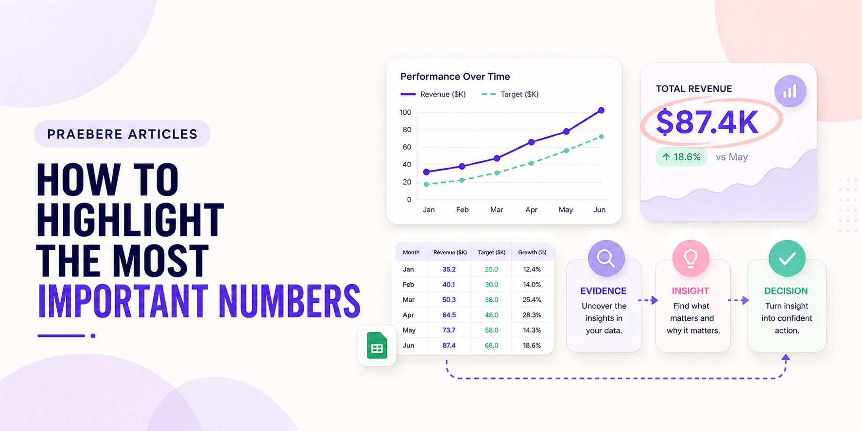
The practical decisions behind “How to Highlight the Most Important Numbers”
The most useful entry point into “How to Highlight the Most Important Numbers” is not decoration, but the problem captured by “Importance comes from the decision, not the visual size.” Start with the analytical question, unit of analysis, metric definition, denominator, time window, baseline, and comparison.
The practical challenge begins when general advice meets real content, real constraints, and a real audience. What question should the data answer, and could the chosen scale or comparison lead viewers toward the wrong conclusion? Which definitions, baselines, filters, and uncertainties must remain visible before the audience can act on the pattern? The sections ahead use these questions to move from the central idea to concrete decisions, technical criteria, and an applied example.
Importance comes from the decision, not the visual size
Select numbers that describe the outcome, change, risk, or action the audience must understand. A large number with no definition, period, unit, or comparison may attract attention without communicating meaning.
Limit the primary values on one screen. When everything is emphasized, readers cannot tell which figure should guide the discussion.
Pair the value with a meaningful reference
Show change from a prior period, distance from a target, relevant benchmark, or contribution to a total. Use explicit labels for percentage points, percentages, currency, counts, and rates because those units are not interchangeable.
Include the data date and population when they affect interpretation. A concise annotation can explain an unusual event or definition change near the number.
Create emphasis through hierarchy and contrast
Position the key value where the reading order begins, give it sufficient size, and reduce the contrast of supporting detail. Use one accent color consistently for the primary signal rather than assigning a different bright color to every metric.
Avoid decorative gauges or oversized icons when a value and a small comparison can communicate more directly. The design should make the number easier to understand, not merely louder.
Use motion only to introduce context or change
Reveal the baseline before the current result, or move from an overview to the important segment. Keep the value stable long enough to read and avoid counting animations that delay access or imply false precision.
In a Praebere presentation, the camera can approach a key metric after its context is established, then continue to the driver or action connected to it. This makes emphasis part of the explanation rather than an isolated visual effect.
Technical implementation notes
Start with the analytical question, unit of analysis, metric definition, denominator, time window, baseline, and comparison. Choose the visual encoding that matches the task: position for precise comparison, length for magnitude, slope for change, and area only when area genuinely represents quantity.
Keep axes, scales, units, filters, sample size, source, and uncertainty visible. Recalculate important values, inspect outliers, avoid truncated axes that exaggerate small changes, and distinguish correlation, attribution, forecast, and target from measured results. The most relevant concepts here are highlight important numbers, KPI design, data emphasis. Define them when first used and apply each term consistently to an observable element, rule, or outcome.
- Metric and denominator are defined
- Scale and baseline do not distort the pattern
- Source, period, filters, and uncertainty are disclosed
- Annotation explains the decision-relevant pattern
Worked example: How to Highlight the Most Important Numbers
Assume monthly conversion moved from 4.0% to 4.6%. Before presenting a 15% relative increase, define conversion, show the absolute change of 0.6 percentage points, disclose the period, denominator, traffic mix, and uncertainty, and compare the same seasonal period when relevant.
Use a line or dot plot with a consistent scale, annotate the intervention date, and separate observation from attribution. End with a decision rule—for example, expand the test only if the lift persists and guardrail metrics remain within their thresholds.
Conclusion
Seen as a whole, the sections on importance comes from the decision, not the visual size, pair the value with a meaningful reference, create emphasis through hierarchy and contrast, and use motion only to introduce context or change move from explanation to application. They show that “How to Highlight the Most Important Numbers” depends on both a clear concept and disciplined execution.
We believe the practical standard should be clear: the best data visual is not the most dramatic one. It is the one that preserves definitions, scale, uncertainty, and context while helping the audience reach an accurate interpretation and an appropriate action.
Create the visual journey
Turn your process into a presentation
Build the diagram, choose the sequence, add narration or webcam video, and preview the camera movement in your browser.
Open Praebere