
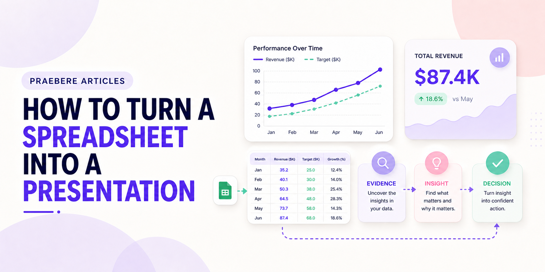
The practical decisions behind “How to Turn a Spreadsheet Into a Presentation”
The visible choices in “How to Turn a Spreadsheet Into a Presentation” grow from the earlier decision described by “Finish the analysis before designing the presentation.” Start with the analytical question, unit of analysis, metric definition, denominator, time window, baseline, and comparison.
The practical challenge begins when general advice meets real content, real constraints, and a real audience. What question should the data answer, and could the chosen scale or comparison lead viewers toward the wrong conclusion? Which definitions, baselines, filters, and uncertainties must remain visible before the audience can act on the pattern? The sections ahead use these questions to move from the central idea to concrete decisions, technical criteria, and an applied example.
Finish the analysis before designing the presentation
A spreadsheet may contain raw records, calculations, assumptions, and several exploratory views. The presentation should not reproduce the workbook. Define the decision or insight, verify formulas, remove duplicates, check missing values, and confirm units and time ranges first.
Preserve the original source and a reproducible analysis path. A polished presentation cannot compensate for numbers that cannot be traced or refreshed.
Select only the evidence needed for the message
Identify the headline result, a meaningful comparison, the main drivers, and any uncertainty the audience needs to consider. Supporting tables can remain in an appendix or linked workbook for readers who need exact detail.
Replace dense cell ranges with charts, short tables, or highlighted values chosen for a specific question. Keep definitions and filters visible when they change how the result should be interpreted.
Build a narrative from context to action
Introduce the business situation and baseline, reveal the important pattern, explain where it appears, and end with implications or recommendations. Use headlines that state the takeaway instead of naming only the chart type.
Maintain consistent scales, colors, periods, and category order across visuals. Unexplained changes make the audience spend time reconciling slides rather than understanding the analysis.
Design for explanation and future updates
Check that every chart remains readable at presentation size and that the narration adds interpretation rather than reciting labels. Record the data date and update process so the presentation is not reused with stale values.
In Praebere, charts can be placed alongside explanatory shapes and process context, then ordered into a guided video presentation. The data should still be prepared and validated in the spreadsheet or analytical tool before it enters the visual story.
Technical implementation notes
Start with the analytical question, unit of analysis, metric definition, denominator, time window, baseline, and comparison. Choose the visual encoding that matches the task: position for precise comparison, length for magnitude, slope for change, and area only when area genuinely represents quantity.
Keep axes, scales, units, filters, sample size, source, and uncertainty visible. Recalculate important values, inspect outliers, avoid truncated axes that exaggerate small changes, and distinguish correlation, attribution, forecast, and target from measured results. The most relevant concepts here are spreadsheet to presentation, present Excel data, data presentation. Define them when first used and apply each term consistently to an observable element, rule, or outcome.
- Metric and denominator are defined
- Scale and baseline do not distort the pattern
- Source, period, filters, and uncertainty are disclosed
- Annotation explains the decision-relevant pattern
Worked example: How to Turn a Spreadsheet Into a Presentation
Assume monthly conversion moved from 4.0% to 4.6%. Before presenting a 15% relative increase, define conversion, show the absolute change of 0.6 percentage points, disclose the period, denominator, traffic mix, and uncertainty, and compare the same seasonal period when relevant.
Use a line or dot plot with a consistent scale, annotate the intervention date, and separate observation from attribution. End with a decision rule—for example, expand the test only if the lift persists and guardrail metrics remain within their thresholds.
Conclusion
The path through finish the analysis before designing the presentation, select only the evidence needed for the message, build a narrative from context to action, and design for explanation and future updates brings the article back to one practical concern: how “How to Turn a Spreadsheet Into a Presentation” behaves outside an ideal example. The technical checks and worked scenario turn the guidance into something a reader can evaluate and apply.
In our view, the best data visual is not the most dramatic one. It is the one that preserves definitions, scale, uncertainty, and context while helping the audience reach an accurate interpretation and an appropriate action.
Create the visual journey
Turn your process into a presentation
Build the diagram, choose the sequence, add narration or webcam video, and preview the camera movement in your browser.
Open Praebere