
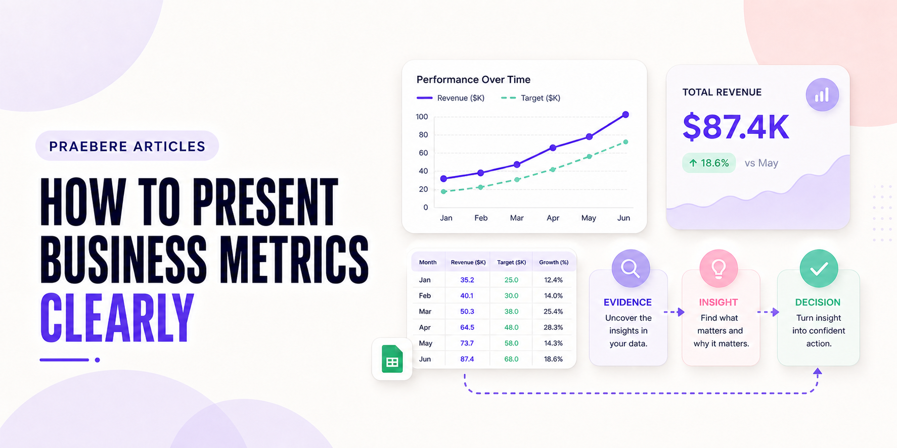
The practical decisions behind “How to Present Business Metrics Clearly”
One issue sets the direction for “How to Present Business Metrics Clearly”: “Connect each metric to a business question.” Translate the communication goal into an audience action: understand, compare, decide, remember, or perform.
The practical challenge begins when general advice meets real content, real constraints, and a real audience. What question should the data answer, and could the chosen scale or comparison lead viewers toward the wrong conclusion? Which definitions, baselines, filters, and uncertainties must remain visible before the audience can act on the pattern? The sections ahead use these questions to move from the central idea to concrete decisions, technical criteria, and an applied example.
Connect each metric to a business question
A metric is useful when the audience understands what it measures and which decision it informs. Begin with the objective, define the indicator, and state the period, population, units, and calculation when those details affect interpretation.
Avoid presenting every available number. Select a small set that describes outcomes, important drivers, risks, and operational health without turning the meeting into a data inventory.
Provide a meaningful comparison
A value without context is difficult to judge. Compare it with a target, prior period, forecast, relevant benchmark, or segmented baseline. Explain whether seasonality or a definition change limits the comparison.
Show both current status and trend when possible. A metric above target but deteriorating requires a different discussion from one below target and improving steadily.
Move from results to drivers and actions
After establishing the outcome, present the factors that plausibly contributed to it and distinguish observed relationships from demonstrated causes. Breakdowns by product, region, channel, or customer group can reveal where the change occurred.
End with the decision, owner, timing, and expected effect. The presentation should help the audience act rather than merely confirm that a dashboard was reviewed.
Use a repeatable visual sequence
A clear sequence might show objective, headline metric, trend, drivers, risks, and next action. Reuse scale, color meaning, and layout so recurring reports become easier to scan over time.
Praebere can connect metrics to a process or decision flow on the same board and guide viewers through the sequence with narration. Keep source data and calculations in the appropriate analytical system, and use the presentation layer to explain their significance.
Technical implementation notes
Translate the communication goal into an audience action: understand, compare, decide, remember, or perform. Build a claim-evidence-reasoning chain and distinguish observed facts, interpretation, assumptions, uncertainty, and recommendations.
Use progressive disclosure: context first, then the model, evidence, exceptions, and implications. Define unfamiliar terms, keep labels close to what they describe, and test whether a reader can reconstruct the intended logic without the presenter present. The most relevant concepts here are present business metrics, KPI presentation, business indicators. Define them when first used and apply each term consistently to an observable element, rule, or outcome.
- Audience and intended action are explicit
- Claims remain connected to evidence
- Assumptions and uncertainty are labeled
- Sequence ends with a clear implication or next step
Worked example: How to Present Business Metrics Clearly
Assume monthly conversion moved from 4.0% to 4.6%. Before presenting a 15% relative increase, define conversion, show the absolute change of 0.6 percentage points, disclose the period, denominator, traffic mix, and uncertainty, and compare the same seasonal period when relevant.
Use a line or dot plot with a consistent scale, annotate the intervention date, and separate observation from attribution. End with a decision rule—for example, expand the test only if the lift persists and guardrail metrics remain within their thresholds.
Conclusion
Seen as a whole, the sections on connect each metric to a business question, provide a meaningful comparison, move from results to drivers and actions, and use a repeatable visual sequence move from explanation to application. They show that “How to Present Business Metrics Clearly” depends on both a clear concept and disciplined execution.
We believe the practical standard should be clear: business communication should connect evidence and uncertainty to a decision, owner, and next action. Concision is useful only when it preserves the context required to act responsibly.
Create the visual journey
Turn your process into a presentation
Build the diagram, choose the sequence, add narration or webcam video, and preview the camera movement in your browser.
Open Praebere