
The definition is only the starting point
Before refining the visuals in “What Is Motion Design in Presentations”, it is worth examining the concern behind “Motion design adds time to visual communication.” Motion should encode a change in state, sequence, hierarchy, or spatial relationship.
The practical challenge begins when general advice meets real content, real constraints, and a real audience. What information does the movement reveal that a static frame cannot show as clearly? Where should the eye land, how long does orientation take, and what happens for viewers who prefer or require reduced motion? The sections ahead use these questions to move from the central idea to concrete decisions, technical criteria, and an applied example.
Motion design adds time to visual communication
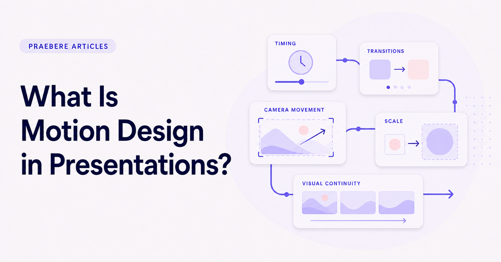
Motion design is the intentional use of movement and timing to communicate visually. In presentations, it includes transitions between views, animated elements, changes in scale, camera movement, and the order in which information appears.
The word intentional matters. An object moving on screen is not automatically useful motion design. Movement should reveal a relationship, show change, direct attention, or preserve continuity between one idea and the next.
Understand the main roles of motion
Motion can explain sequence by showing what happens first and next. It can demonstrate cause and effect, compare a before and after state, or bring a detail forward without removing the surrounding context.
Transitions can also signal narrative structure. A small movement between connected process steps feels different from a larger change that introduces a new chapter. The motion language should reflect that difference consistently.
- Reveal order and progression.
- Direct attention to the current subject.
- Maintain spatial continuity.
- Show change, comparison, or consequence.
Timing shapes how motion feels
The duration of a movement affects whether it feels calm, urgent, heavy, or abrupt. Important information needs enough time to arrive and remain visible. Fast motion can work for minor transitions, while complex changes require a slower pace.
Acceleration and deceleration influence naturalness. Sudden starts and stops can be useful for emphasis but become tiring when repeated. Smooth easing often supports continuity because the audience can follow where an element came from and where it is going.
Use restraint and consider accessibility
Excessive zoom, rapid movement, flashing, and constant animation can make a presentation uncomfortable or difficult to follow. Limit simultaneous motion and avoid effects that do not contribute to the message.
Provide a reduced-motion or static alternative when the publishing environment supports it. Essential information should not depend only on an animation that may be skipped, disabled, or difficult for some viewers to perceive.
Apply motion to a connected visual board
A diagram provides a spatial foundation for motion. The camera can move along connectors, zoom into the current stage, and return to an overview when the audience needs context. The path itself becomes part of the explanation.
Praebere is designed for this sequence-based approach. You order elements, adjust framing, add voice or webcam video, and export the guided path as video. The edited feeling comes from connecting the visual structure to timing and camera movement rather than building a traditional video timeline.
Technical implementation notes
Motion should encode a change in state, sequence, hierarchy, or spatial relationship. Specify the start state, end state, duration, easing curve, trigger, and what the audience should notice; otherwise animation becomes decoration rather than information.
Preserve object continuity and avoid simultaneous competing motion. Preview at normal speed, support reduced-motion preferences where the delivery format allows it, and confirm that the same meaning remains available in a static frame, transcript, or alternative explanation. The most relevant concepts here are motion design presentations, presentation animation, motion graphics slides. Define them when first used and apply each term consistently to an observable element, rule, or outcome.
- One attentional target at a time
- Stable spatial continuity between states
- Duration matches the amount of information revealed
- Static or reduced-motion alternative preserves meaning
Worked example: What Is Motion Design in Presentations?
Picture a five-step incident-response diagram. Keep the complete map stable, then move the camera to the active node over roughly the time needed to orient the viewer. Reveal the outgoing connector only when explaining the handoff, and pause before changing direction at a decision.
Compare the animated version with a static overview. If movement does not clarify sequence, state change, or spatial relationship, remove it. Also preview a reduced-motion treatment using cuts or gentle fades so the explanation does not depend on sweeping zooms.
Conclusion
Rather than reducing “What Is Motion Design in Presentations?” to a checklist, the article linked motion design adds time to visual communication, understand the main roles of motion, timing shapes how motion feels, use restraint and consider accessibility, and apply motion to a connected visual board. That combination explains not only what to do, but also why the choices matter and how to inspect the outcome.
Our judgment after considering the full article is that movement deserves a place only when it explains sequence, continuity, state, causality, or emphasis. Restrained informative motion strengthens an explanation; purposeless motion taxes attention.
Create the visual journey
Turn your process into a presentation
Build the diagram, choose the sequence, add narration or webcam video, and preview the camera movement in your browser.
Open Praebere