
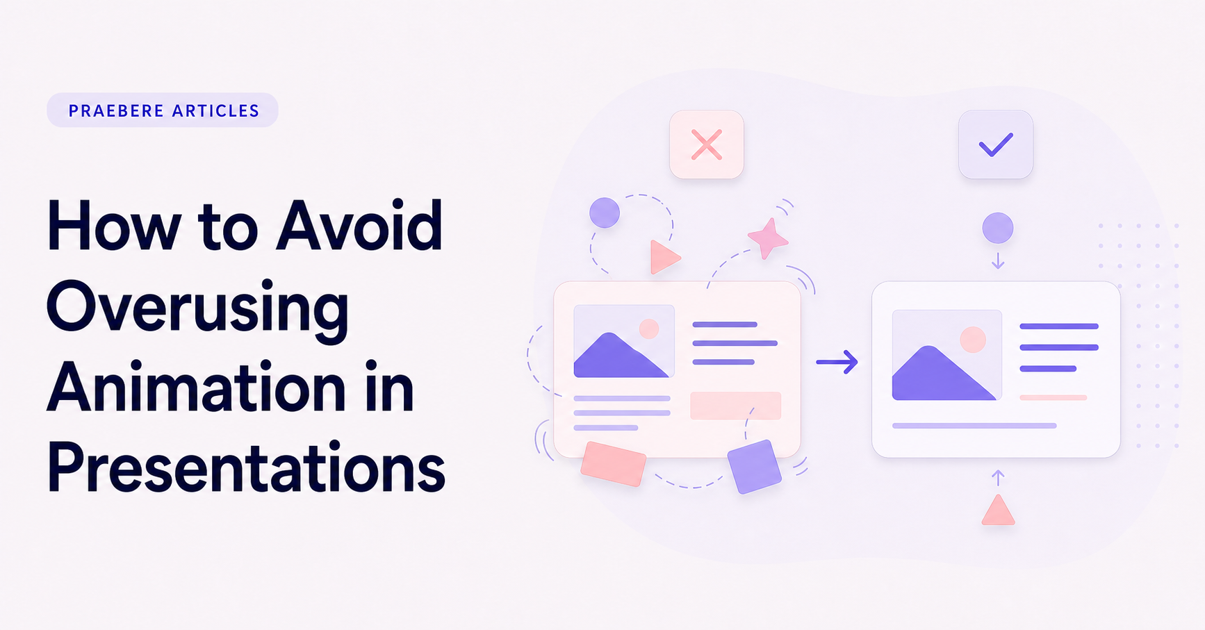
The practical decisions behind “How to Avoid Overusing Animation in Presentations”
The value of “How to Avoid Overusing Animation in Presentations” becomes clearer when attention shifts to “Recognize when animation is competing with content.” Motion should encode a change in state, sequence, hierarchy, or spatial relationship.
The practical challenge begins when general advice meets real content, real constraints, and a real audience. What information does the movement reveal that a static frame cannot show as clearly? Where should the eye land, how long does orientation take, and what happens for viewers who prefer or require reduced motion? The sections ahead use these questions to move from the central idea to concrete decisions, technical criteria, and an applied example.
Recognize when animation is competing with content
Animation is overused when the audience notices effects more than ideas. Frequent entrances, different transition styles, continuous movement, and objects that animate independently can make it difficult to decide where to look.
The problem is not only visual taste. Excessive motion consumes time, interrupts reading, and removes stable reference points. It can also make the presentation uncomfortable for viewers who are sensitive to rapid movement or repeated zooming.
Define a small motion system
Choose a limited set of behaviors before animating individual slides. You may use one transition for related steps, another for major section changes, and a restrained highlight for emphasis. Repeating those rules makes motion predictable and meaningful.
Equivalent actions should move in equivalent ways. If one process step fades in and the next spins or bounces without a reason, the effects suggest differences that the content does not support.
- One behavior for revealing content.
- One behavior for moving between related views.
- One clear signal for section changes.
- One restrained emphasis treatment.
Animate groups instead of every element
A card containing an icon, title, and supporting text usually represents one idea. Animate it as a unit rather than giving each internal element a separate entrance. Grouped motion reduces delay and preserves the component’s visual relationship.
Keep background decoration and persistent navigation still unless movement communicates a real state change. Motion in peripheral areas can draw attention away from the primary content even when it is subtle.
Reduce speed, distance, and simultaneous movement
Large, fast movements feel more intense than small, controlled ones. Use the shortest distance that explains the relationship, and avoid moving several independent elements at once. Give the audience a stable destination after each transition.
Review the complete presentation rather than testing animations only in isolation. Effects that feel acceptable once can become exhausting when repeated across many slides. Remove every movement that does not improve comprehension.
Preview motion as part of the final experience
Watch the presentation at normal speed with narration. Check whether text arrives at the right moment, whether important frames remain visible long enough, and whether repeated zoom changes feel comfortable. Consider a static or reduced-motion alternative when the publishing environment allows it.
In Praebere, camera movement follows the visual sequence you define. Preview the entire path and simplify abrupt framing changes, unnecessary connector animation, and repeated zooms. The goal is an edited-feeling video in which motion supports the explanation without becoming the subject.
Technical implementation notes
Motion should encode a change in state, sequence, hierarchy, or spatial relationship. Specify the start state, end state, duration, easing curve, trigger, and what the audience should notice; otherwise animation becomes decoration rather than information.
Preserve object continuity and avoid simultaneous competing motion. Preview at normal speed, support reduced-motion preferences where the delivery format allows it, and confirm that the same meaning remains available in a static frame, transcript, or alternative explanation. The most relevant concepts here are avoid excessive animation, presentation animation mistakes, subtle slide animation. Define them when first used and apply each term consistently to an observable element, rule, or outcome.
- One attentional target at a time
- Stable spatial continuity between states
- Duration matches the amount of information revealed
- Static or reduced-motion alternative preserves meaning
Worked example: How to Avoid Overusing Animation in Presentations
Picture a five-step incident-response diagram. Keep the complete map stable, then move the camera to the active node over roughly the time needed to orient the viewer. Reveal the outgoing connector only when explaining the handoff, and pause before changing direction at a decision.
Compare the animated version with a static overview. If movement does not clarify sequence, state change, or spatial relationship, remove it. Also preview a reduced-motion treatment using cuts or gentle fades so the explanation does not depend on sweeping zooms.
Conclusion
The article’s main threads—recognize when animation is competing with content, define a small motion system, animate groups instead of every element, reduce speed, distance, and simultaneous movement, and preview motion as part of the final experience—lead to a shared lesson: the quality of “How to Avoid Overusing Animation in Presentations” can be tested. Technical criteria and a realistic example make strengths, omissions, and consequences visible.
The strongest takeaway, in our opinion, is that movement deserves a place only when it explains sequence, continuity, state, causality, or emphasis. Restrained informative motion strengthens an explanation; purposeless motion taxes attention.
Create the visual journey
Turn your process into a presentation
Build the diagram, choose the sequence, add narration or webcam video, and preview the camera movement in your browser.
Open Praebere