
The definition is only the starting point
The visible choices in “What Is Visual Communication and Why Does It Matter” grow from the earlier decision described by “What it means to communicate visually.” Translate the communication goal into an audience action: understand, compare, decide, remember, or perform.
The practical challenge begins when general advice meets real content, real constraints, and a real audience. What question carries the audience from the opening to the conclusion, and why should the answer matter to them? How can context, evidence, tension, examples, and resolution form a coherent path without manipulating or oversimplifying the facts? The sections ahead use these questions to move from the central idea to concrete decisions, technical criteria, and an applied example.
What it means to communicate visually
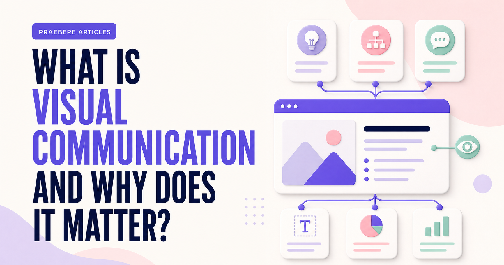
Visual communication is the intentional use of elements that people can see to convey a message. Photographs, illustrations, icons, diagrams, shapes, color, typography, space, and motion are all part of this vocabulary. They do more than decorate: they can show relationships, establish priorities, and help viewers understand where to begin.
A visual message can also contain words. The difference lies in how text and graphic elements work together. Instead of giving every piece of information the same appearance, the composition distinguishes titles, details, sequences, comparisons, and conclusions. This organization reduces the effort required to interpret the content.
Why visual communication matters
When an idea contains steps, dependencies, or alternatives, a block of text can hide its structure. A flowchart makes paths and decisions visible, a timeline clarifies order, and a side-by-side comparison makes differences easier to find. The format should match the relationship that needs to be explained.
Visual communication also guides attention. Size, contrast, position, and spacing indicate what the audience should notice first and what can be read later. This matters in presentations, training materials, reports, digital pages, and operating instructions, where readers need to find the right information without guessing the author's intent.
- Makes abstract relationships visible.
- Separates essential information from supporting detail.
- Creates a predictable reading path.
- Makes processes and arguments easier to review.
How visual elements work together
No single device can solve the message by itself. A strong color loses its effect when everything is colorful, a large heading does not create hierarchy when all text has the same weight, and animation cannot clarify a sequence whose underlying order is confusing. The result depends on a coherent system, not on the number of effects.
Define a simple rule for each function. You might use one family of shapes for actions, another for decisions, one accent color for critical points, and consistent styles for headings and supporting text. Repeating these rules creates familiarity and lets the audience recognize patterns before reading every word.
Put clarity before aesthetics
A beautiful composition can still be difficult to understand. Before adjusting shadows, borders, or transitions, confirm that the message has a clear objective, every element serves a function, and the reading order matches the reasoning you intend to present. Removing noise often improves communication more than adding polish.
Test the material under realistic conditions. View it at its final size, check contrast, and ask someone to describe the main idea without additional explanation. If they do not know where to begin or interpret a relationship differently, revise the visual structure.
Bring visual communication into a moving presentation
In video, time becomes part of the composition. The camera can reveal a process gradually, approach a detail, and then show how it connects to the whole. Movement should follow the reasoning: first the idea, then the relationship, and finally the consequence. Purposeless transitions only compete with the content.
In Praebere, you can organize a diagram, define the element sequence, add narration or webcam video, and export the journey as video. You still create the content; the tool helps turn the visual structure into a presentation with framing, zoom, and transitions based on the order you choose.
Technical implementation notes
Translate the communication goal into an audience action: understand, compare, decide, remember, or perform. Build a claim-evidence-reasoning chain and distinguish observed facts, interpretation, assumptions, uncertainty, and recommendations.
Use progressive disclosure: context first, then the model, evidence, exceptions, and implications. Define unfamiliar terms, keep labels close to what they describe, and test whether a reader can reconstruct the intended logic without the presenter present. The most relevant concepts here are visual communication, visual language, visual presentation. Define them when first used and apply each term consistently to an observable element, rule, or outcome.
- Audience and intended action are explicit
- Claims remain connected to evidence
- Assumptions and uncertainty are labeled
- Sequence ends with a clear implication or next step
Worked example: What Is Visual Communication and Why Does It Matter?
Consider a proposal to reduce customer wait time. Open with the current customer journey and measured delay, explain the operational bottleneck, compare two credible interventions, and reveal the recommendation only after the decision criteria and evidence are visible.
Keep observed data separate from interpretation and state the assumptions behind the forecast. The ending should resolve the opening question with an owner, next action, and measure of success, so narrative structure supports a real decision rather than manufacturing suspense.
Conclusion
The path through what it means to communicate visually, why visual communication matters, how visual elements work together, put clarity before aesthetics, and bring visual communication into a moving presentation brings the article back to one practical concern: how “What Is Visual Communication and Why Does It Matter?” behaves outside an ideal example. The technical checks and worked scenario turn the guidance into something a reader can evaluate and apply.
Our judgment after considering the full article is that clear visual communication combines purposeful structure, accurate information, meaningful examples, and validation with the intended audience. Looking coherent is not enough; the result should help people understand and use the idea correctly.
Create the visual journey
Turn your process into a presentation
Build the diagram, choose the sequence, add narration or webcam video, and preview the camera movement in your browser.
Open Praebere