
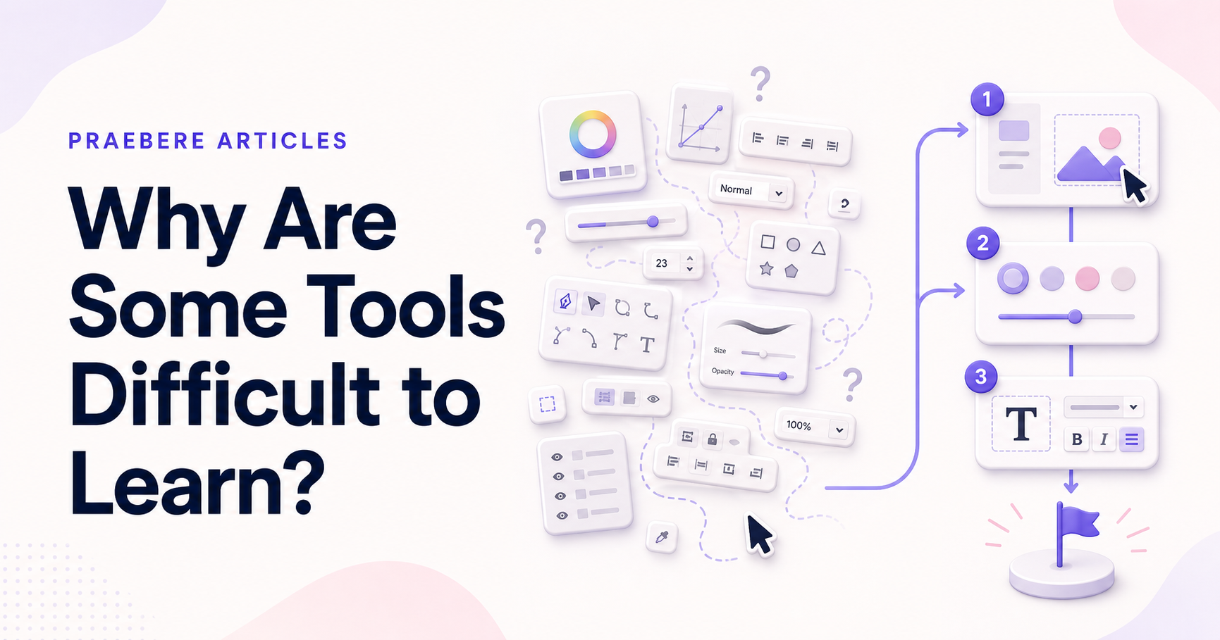
The obvious answer is only the beginning
The work behind “Why Are Some Tools Difficult to Learn” starts with a practical concern captured by “A large feature set is not the only cause of difficulty.” Model the user, task, environment, device, and failure cost before choosing controls.
The practical challenge begins when general advice meets real content, real constraints, and a real audience. Can a first-time user predict the result of an action, see the current state, and recover from a mistake? Does the same task remain understandable with touch, keyboard, zoom, latency, and a smaller screen? The sections ahead use these questions to move from the central idea to concrete decisions, technical criteria, and an applied example.
A large feature set is not the only cause of difficulty
Powerful tools often require learning, but complexity becomes unnecessary when the interface does not match the way users think about their work. People arrive with a goal such as connecting two ideas or recording an explanation. If the software requires them to translate that goal into unfamiliar internal concepts, the learning curve grows.
Difficulty also accumulates through small uncertainties. A person may not know what is selected, which mode is active, where a new object will appear, or whether an action has been saved. Each question consumes attention that should be available for the task.
Unfamiliar terminology increases the learning burden
Labels should describe the user goal whenever possible. Technical names inherited from implementation or specialist disciplines can be accurate but still difficult for a broader audience. Pair unfamiliar terms with examples, previews, or short explanations until users can recognize them.
The organization of controls matters as much as their names. Related settings should appear together, and the same concept should not be described differently across menus. Consistent structure turns repeated use into learning.
- Use action-oriented labels.
- Show a preview when a name alone is ambiguous.
- Keep related properties in the same group.
- Use the same term for the same concept everywhere.
Teach actions in context instead of explaining everything first
Long introductory tours ask users to remember controls before they have a reason to use them. A more effective approach offers a clear first task, sensible defaults, and brief guidance at the moment a new capability becomes relevant.
Examples and templates can reduce the blank-page problem, but they should remain editable and explain their structure. Users learn faster when they can change a working example, observe the result, and recover easily if an experiment fails.
Make knowledge transferable across the interface
Once a user learns how to select, move, style, and delete one element, those actions should work similarly for other elements. Reusing interaction patterns lowers the amount of new knowledge required for each feature and makes advanced behavior easier to predict.
In a visual tool such as Praebere, consistent selection handles, property groups, ordering controls, and previews help users build a stable mental model. The goal is not to remove every advanced capability, but to let each new capability build on something the user already understands.
Technical implementation notes
Model the user, task, environment, device, and failure cost before choosing controls. Direct manipulation needs visible affordances, immediate feedback, forgiving hit targets, keyboard equivalents, undo, and state that remains understandable without relying on memory.
Evaluate representative tasks with observable success criteria such as completion rate, time, errors, recoveries, and assistance required. Include touch, keyboard, zoom, small screens, latency, empty states, invalid input, and interrupted work in the test plan. The most relevant concepts here are software learning curve, tool usability, visual editor learning. Define them when first used and apply each term consistently to an observable element, rule, or outcome.
- The current state and available action are visible
- Errors are preventable and recoverable
- Keyboard and touch paths reach the same outcome
- Testing uses realistic content and devices
Worked example: Why Are Some Tools Difficult to Learn?
Imagine a first-time touch user placing a shape, editing its title, connecting it, and undoing an accidental move. The element needs a large enough hit target, visible selected state, movement threshold that differs from a tap, alignment feedback, auto-scroll near edges, and an undo action that restores position and connections.
Test the same task with mouse, touch, keyboard, zoom, and a small screen. Record errors and recovery, not just completion. If users repeatedly open the wrong property group or cannot predict the drop result, change the interaction model and test again.
Conclusion
Taken together, a large feature set is not the only cause of difficulty, hidden modes and rules make behavior unpredictable, unfamiliar terminology increases the learning burden, teach actions in context instead of explaining everything first, and make knowledge transferable across the interface show that “Why Are Some Tools Difficult to Learn?” is not an isolated technique. The article connected its central principles to implementation details and a practical case, making the tradeoffs easier to see.
We believe the practical standard should be clear: good interaction design makes state, consequences, and recovery understandable across mouse, keyboard, and touch. The interface should consume less attention than the creative problem the user is trying to solve.
Create the visual journey
Turn your process into a presentation
Build the diagram, choose the sequence, add narration or webcam video, and preview the camera movement in your browser.
Open Praebere