
The definition is only the starting point
A reader can understand “What Is User Experience in Presentation Tools” more clearly by first looking at “User experience includes the complete creation process.” Model the user, task, environment, device, and failure cost before choosing controls.
The practical challenge begins when general advice meets real content, real constraints, and a real audience. Can a first-time user predict the result of an action, see the current state, and recover from a mistake? Does the same task remain understandable with touch, keyboard, zoom, latency, and a smaller screen? The sections ahead use these questions to move from the central idea to concrete decisions, technical criteria, and an applied example.
User experience includes the complete creation process
User experience, often shortened to UX, describes how a person understands, uses, and feels about a tool while trying to accomplish a goal. In presentation software, that experience begins before the first element is added and continues through organizing content, revising the design, rehearsing, exporting, and sharing the result.
A polished interface is only one part of the experience. A tool can look attractive and still be frustrating if common actions are hard to find, selections are unpredictable, or exporting introduces unexpected limitations. Good UX connects visual clarity with dependable behavior.
Good presentation UX balances speed and control
Beginners need clear starting points, understandable labels, and safe defaults. Experienced users need precision, shortcuts, reusable styles, and efficient ways to manage many elements. A strong editor supports both groups without exposing every advanced option at the same time.
The interface should make frequent actions easy while keeping less common controls available when they are relevant. This approach is often called progressive disclosure: complexity appears as the task requires it rather than occupying the screen from the beginning.
- Clear feedback after every action.
- Predictable selection, movement, and resizing.
- Undo for actions that can change or remove work.
- Readable controls for keyboard, mouse, and touch users.
The interface should protect creative flow
Presentation work alternates between thinking and editing. The user may be arranging a story, comparing visual options, or checking a small alignment detail. Interruptions such as unnecessary dialogs, hidden mode changes, and slow previews force attention away from the content and toward the software.
Helpful defaults reduce setup, but they should not lock the user into one style. Templates, snapping, automatic alignment, and ready-made visual treatments work best when they accelerate a decision and remain easy to adjust or remove.
Feedback and recovery create confidence
Every interaction should produce a visible and timely response. Selected elements need a clear state, drag targets should be recognizable, and long operations should communicate progress. When the result of an action is ambiguous, users repeat commands or hesitate because they do not trust the interface.
Mistakes are normal in creative work. Undo, autosave, non-destructive editing, and clear confirmation for irreversible actions allow experimentation without fear. Confidence is a practical UX outcome because it makes people more willing to explore the tool.
Evaluate the experience through real presentation tasks
A useful UX review follows realistic goals: create a visual sequence, edit several objects, add media, preview the result, and export it. Measure where users pause, make errors, or search for controls. The number of features matters less than whether people can complete the work with confidence.
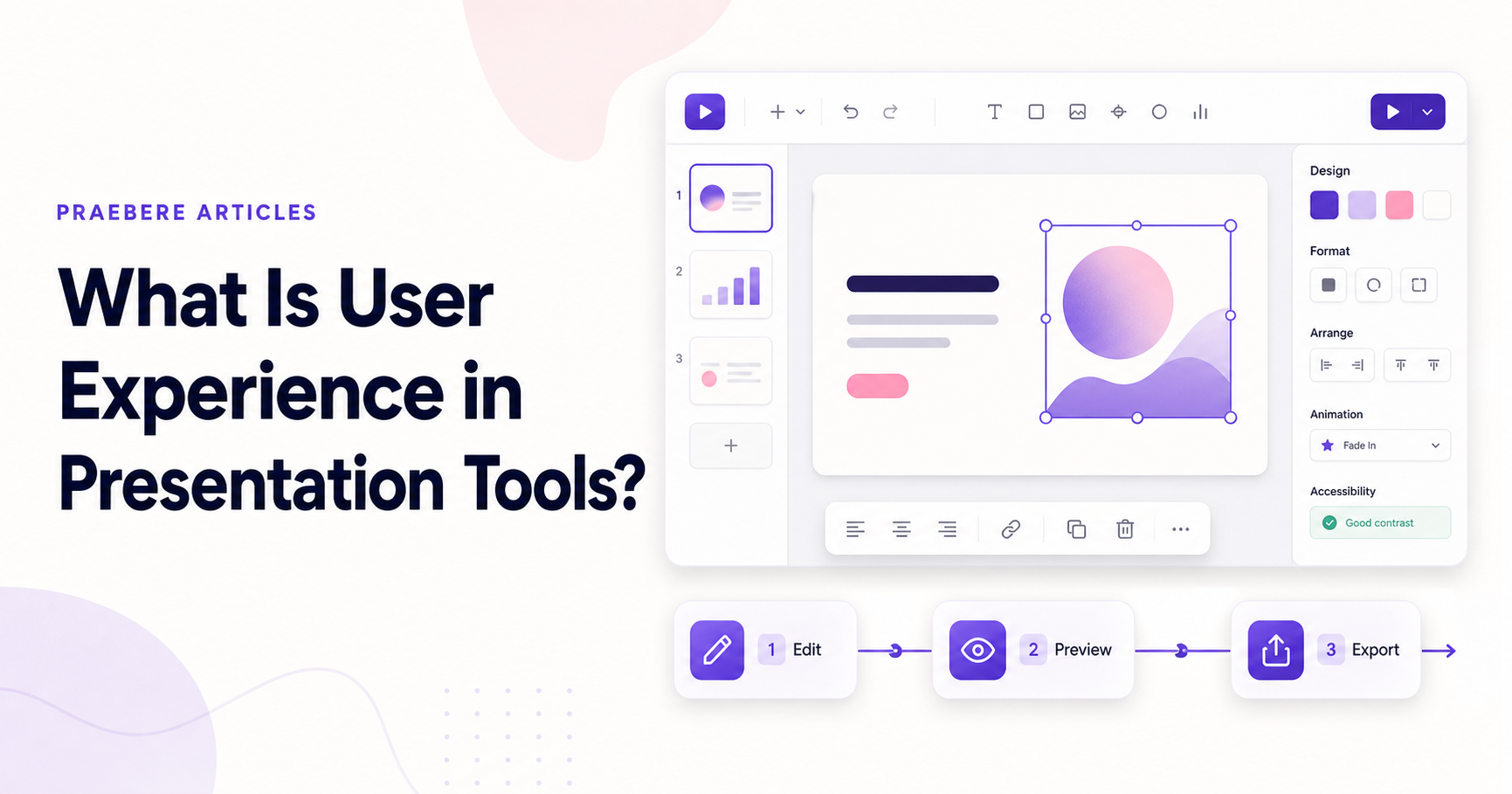
Praebere combines diagram creation with a sequenced video workflow, so the experience must connect editing, ordering, narration, camera framing, and export. Keeping those stages visible and related helps the user understand how a visual board becomes a finished presentation video.
Technical implementation notes
Model the user, task, environment, device, and failure cost before choosing controls. Direct manipulation needs visible affordances, immediate feedback, forgiving hit targets, keyboard equivalents, undo, and state that remains understandable without relying on memory.
Evaluate representative tasks with observable success criteria such as completion rate, time, errors, recoveries, and assistance required. Include touch, keyboard, zoom, small screens, latency, empty states, invalid input, and interrupted work in the test plan. The most relevant concepts here are presentation tool user experience, presentation software UX, visual editor usability. Define them when first used and apply each term consistently to an observable element, rule, or outcome.
- The current state and available action are visible
- Errors are preventable and recoverable
- Keyboard and touch paths reach the same outcome
- Testing uses realistic content and devices
Worked example: What Is User Experience in Presentation Tools?
Imagine a first-time touch user placing a shape, editing its title, connecting it, and undoing an accidental move. The element needs a large enough hit target, visible selected state, movement threshold that differs from a tap, alignment feedback, auto-scroll near edges, and an undo action that restores position and connections.
Test the same task with mouse, touch, keyboard, zoom, and a small screen. Record errors and recovery, not just completion. If users repeatedly open the wrong property group or cannot predict the drop result, change the interaction model and test again.
Conclusion
Rather than reducing “What Is User Experience in Presentation Tools?” to a checklist, the article linked user experience includes the complete creation process, good presentation ux balances speed and control, the interface should protect creative flow, feedback and recovery create confidence, and evaluate the experience through real presentation tasks. That combination explains not only what to do, but also why the choices matter and how to inspect the outcome.
For us, the idea reaches its most useful conclusion here: good interaction design makes state, consequences, and recovery understandable across mouse, keyboard, and touch. The interface should consume less attention than the creative problem the user is trying to solve.
Create the visual journey
Turn your process into a presentation
Build the diagram, choose the sequence, add narration or webcam video, and preview the camera movement in your browser.
Open Praebere