
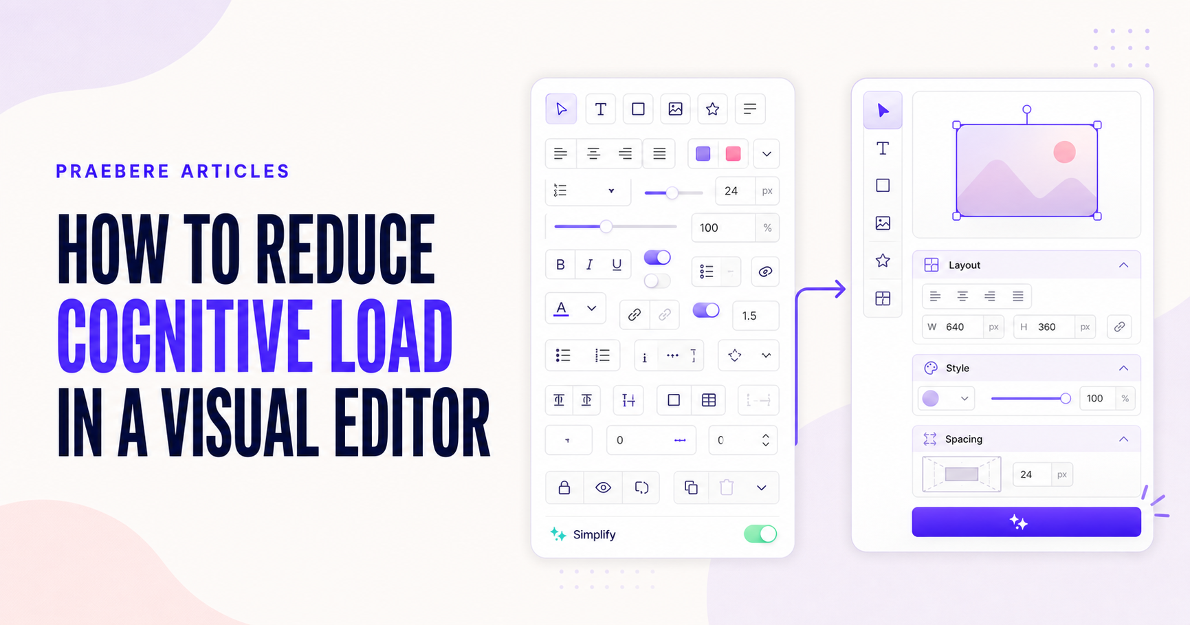
The practical decisions behind “How to Reduce Cognitive Load in a Visual Editor”
The work behind “How to Reduce Cognitive Load in a Visual Editor” starts with a practical concern captured by “Protect the attention needed for the creative task.” Model the user, task, environment, device, and failure cost before choosing controls.
The practical challenge begins when general advice meets real content, real constraints, and a real audience. What must the audience notice now, connect to prior knowledge, and retrieve later? Is the design reducing unnecessary mental work, or is it using color, motion, and density to compete for the same limited attention? The sections ahead use these questions to move from the central idea to concrete decisions, technical criteria, and an applied example.
Protect the attention needed for the creative task
A visual editor already asks users to make decisions about content, structure, hierarchy, alignment, and style. The interface adds unnecessary cognitive load when people must also remember hidden rules, search through unrelated controls, or repeatedly verify what the software is doing.
The goal is not to remove every choice. It is to reduce mental effort that does not contribute to the result. A capable editor can remain powerful while presenting decisions in a clear order and keeping important state visible.
Reduce competition among visible controls
When every command has the same visual weight, users must inspect the entire interface to find the next action. Establish hierarchy through grouping, spacing, labels, and restrained emphasis. Frequent actions should be easy to scan, while specialized settings can remain inside clearly named sections.
Contextual properties reduce clutter by showing controls that apply to the current selection. However, hiding too much can create a memory problem. Keep the main structure stable so users know where options will appear when they become relevant.
- Group controls by task rather than by implementation.
- Use clear section labels and consistent order.
- Show relevant properties for the current selection.
- Avoid duplicate controls with unclear differences.
Keep system state visible instead of relying on memory
Users should not have to remember the active tool, selected object, zoom level, layer, or pending operation. Visible selection outlines, active states, breadcrumbs, and status indicators move that information from memory into the interface.
Feedback should appear close to the action and at the right time. Alignment guides during movement, a destination highlight during dragging, and a concise confirmation after export are more useful than a distant message that requires interpretation.
Use good defaults and consistent interaction rules
Defaults remove repeated decisions when they reflect a sensible common outcome. New shapes can begin with readable text, visible contrast, and a predictable size. Templates and styles can accelerate composition, provided the user can understand and change what was applied.
Consistency lets one learned pattern support many tasks. Selection, movement, deletion, styling, and undo should behave similarly across object types. Exceptions should be rare and clearly signaled because every exception adds another rule the user must remember.
Break long workflows into meaningful stages
Complex creation work becomes manageable when the interface reflects its natural stages. Separate content creation from sequencing, preview, and export, but keep the relationship between those stages visible. Users should understand what is complete, what remains, and how an earlier decision affects the final result.
Praebere organizes a visual presentation around the board and the ordered path through its elements. Clear property groups, ready-made styles, direct manipulation, and preview controls can reduce setup effort while preserving creative control. The best test is whether the user can focus on explaining the idea rather than remembering how the editor works.
Technical implementation notes
Model the user, task, environment, device, and failure cost before choosing controls. Direct manipulation needs visible affordances, immediate feedback, forgiving hit targets, keyboard equivalents, undo, and state that remains understandable without relying on memory.
Evaluate representative tasks with observable success criteria such as completion rate, time, errors, recoveries, and assistance required. Include touch, keyboard, zoom, small screens, latency, empty states, invalid input, and interrupted work in the test plan. The most relevant concepts here are reduce cognitive load, visual editor usability, interface complexity. Define them when first used and apply each term consistently to an observable element, rule, or outcome.
- The current state and available action are visible
- Errors are preventable and recoverable
- Keyboard and touch paths reach the same outcome
- Testing uses realistic content and devices
Worked example: How to Reduce Cognitive Load in a Visual Editor
Suppose an audience must remember a three-part response model: detect, contain, recover. Present the complete model once, explain each part with one distinct case, then hide the labels and ask viewers to reconstruct the order and choose the correct response for a new incident.
Observe where retrieval fails. If people confuse steps, strengthen the relationship and practice rather than adding more decoration. Send a compact reference and repeat a different scenario later; immediate recognition during the presentation is not evidence of durable memory.
Conclusion
Taken together, protect the attention needed for the creative task, reduce competition among visible controls, keep system state visible instead of relying on memory, use good defaults and consistent interaction rules, and break long workflows into meaningful stages show that “How to Reduce Cognitive Load in a Visual Editor” is not an isolated technique. The article connected its central principles to implementation details and a practical case, making the tradeoffs easier to see.
The strongest takeaway, in our opinion, is that good interaction design makes state, consequences, and recovery understandable across mouse, keyboard, and touch. The interface should consume less attention than the creative problem the user is trying to solve.
Create the visual journey
Turn your process into a presentation
Build the diagram, choose the sequence, add narration or webcam video, and preview the camera movement in your browser.
Open Praebere