
A closer look at the decisions behind “How Camera Zoom and Motion Improve a Video Presentation”
Before refining the visuals in “How Camera Zoom and Motion Improve a Video Presentation”, it is worth examining the concern behind “Camera movement is an attention system.” Motion should encode a change in state, sequence, hierarchy, or spatial relationship.
The practical challenge begins when general advice meets real content, real constraints, and a real audience. What information does the movement reveal that a static frame cannot show as clearly? Where should the eye land, how long does orientation take, and what happens for viewers who prefer or require reduced motion? The sections ahead use these questions to move from the central idea to concrete decisions, technical criteria, and an applied example.
Camera movement is an attention system
In a visual presentation, the camera decides what is readable and important at each moment. A close frame signals detail. A wider frame restores context. Movement connects the two.
Motion should reduce the effort required to follow the story. If the viewer notices the zoom more than the idea, the effect is too strong or too frequent.
Choose a readable frame for every step
Frame the active element with enough surrounding space to show relevant connections. Text should remain comfortably readable, but the shape should not fill the screen so tightly that its relationship to the diagram disappears.
Large containers and slides may need a wider default frame, while a small decision node may need a closer view. Preview on a smaller screen to confirm the choice.
Create a consistent movement rhythm
Use similar transition durations for similar distances. Slow down when crossing a large diagram or introducing a new chapter. Short nearby movements can be faster, provided the text has time to settle before narration continues.
Avoid alternating repeatedly between extreme close-ups and wide views. A stable visual rhythm helps the viewer remain oriented.
Design for comfort and clarity
Keep rotation rare, avoid rapid acceleration, and limit continuous motion behind text. Provide pauses at important steps. If the format allows it, respect reduced-motion preferences in interactive versions.
The presentation should still make sense when paused on any important frame. Motion adds guidance; it should not carry information that disappears immediately.
- Move only with a destination.
- Keep text still while it is read.
- Use wide views to restore context.
- Preview the entire sequence at normal speed.
Configure zoom as part of the sequence
Praebere allows presentation steps to use their own camera framing and zoom. Video and webcam media can play inside their elements while the board camera follows the configured view.
Set the framing after the diagram layout is stable. Then review transitions in sequence, because a good frame in isolation may still create an awkward move from the previous step.
Technical implementation notes
Motion should encode a change in state, sequence, hierarchy, or spatial relationship. Specify the start state, end state, duration, easing curve, trigger, and what the audience should notice; otherwise animation becomes decoration rather than information.
Preserve object continuity and avoid simultaneous competing motion. Preview at normal speed, support reduced-motion preferences where the delivery format allows it, and confirm that the same meaning remains available in a static frame, transcript, or alternative explanation. The most relevant concepts here are presentation camera zoom, motion presentation, zoom presentation. Define them when first used and apply each term consistently to an observable element, rule, or outcome.
- One attentional target at a time
- Stable spatial continuity between states
- Duration matches the amount of information revealed
- Static or reduced-motion alternative preserves meaning
Worked example: How Camera Zoom and Motion Improve a Video Presentation
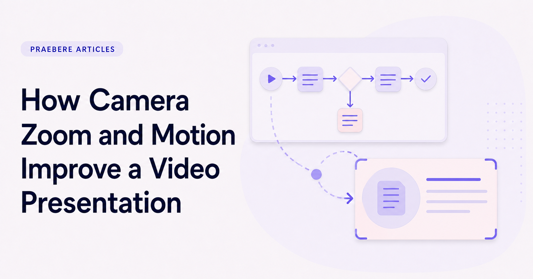
Picture a five-step incident-response diagram. Keep the complete map stable, then move the camera to the active node over roughly the time needed to orient the viewer. Reveal the outgoing connector only when explaining the handoff, and pause before changing direction at a decision.
Compare the animated version with a static overview. If movement does not clarify sequence, state change, or spatial relationship, remove it. Also preview a reduced-motion treatment using cuts or gentle fades so the explanation does not depend on sweeping zooms.
Conclusion
Rather than reducing “How Camera Zoom and Motion Improve a Video Presentation” to a checklist, the article linked camera movement is an attention system, choose a readable frame for every step, create a consistent movement rhythm, design for comfort and clarity, and configure zoom as part of the sequence. That combination explains not only what to do, but also why the choices matter and how to inspect the outcome.
We believe the practical standard should be clear: movement deserves a place only when it explains sequence, continuity, state, causality, or emphasis. Restrained informative motion strengthens an explanation; purposeless motion taxes attention.
Create the visual journey
Turn your process into a presentation
Build the diagram, choose the sequence, add narration or webcam video, and preview the camera movement in your browser.
Open Praebere